
2021
#Industrial Design
Rhinohead Booth
This project sought to design a booth system for a biking apparel brand. The design focused not only on marketing the merchandise, but also educating beginner cyclists of best practices.

Brand and User Research
I first conducted brand and user research in my first week. I was able to dissect the client brand’s visual language and target market and then send out an online survey catering to mapping out beginner cyclists’ experience in purchasing biking apparel for the first time.
People were intimidated going to a bike store for the first time due to:
- Overwhelmed by the sheer number of options available
- New jargon and terminologies
- Very “manly”
- Felt judged by people (men) because of not knowing what to do
- Catered to more experienced riders; no entry-level
- No labels; just straight up displays

Context: Beginner/aspiring/hobbyist cyclists in their 20s-30s of middle-middle class to high-end who would want to know the ins and outs of the recreational activity.
Goal: To browse and eventually purchase cycling gear despite not having any knowledge and background on the activity in a beginner-friendly, non-intimidating environment.
Pain points: Not knowing where to start.
Behavior: They are shy and intimidated to enter the booth as the market is typically saturated with professional cyclists, but are curious to learn more and purchase the necessary gear for the activity.
User Flow and Considerations
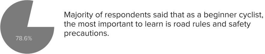
Beginner cyclists emphasized the importance of road safety. With this, their priority in purchasing their first biking gear as beginner cyclists is as follows:
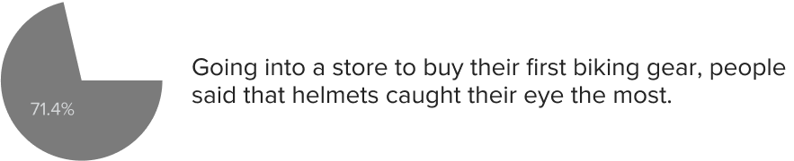
- Helmet
- Gloves
- Jersey set
- Arm protector
- T-shirt
- Cap

Design considerations
- 3mx2mx2.13m
- Not too aggressive nor smooth
- Casual and beginner-friendly
- Must be interactive
- Must educate and showcase gear and equipment
Concept Development
Layout Flow


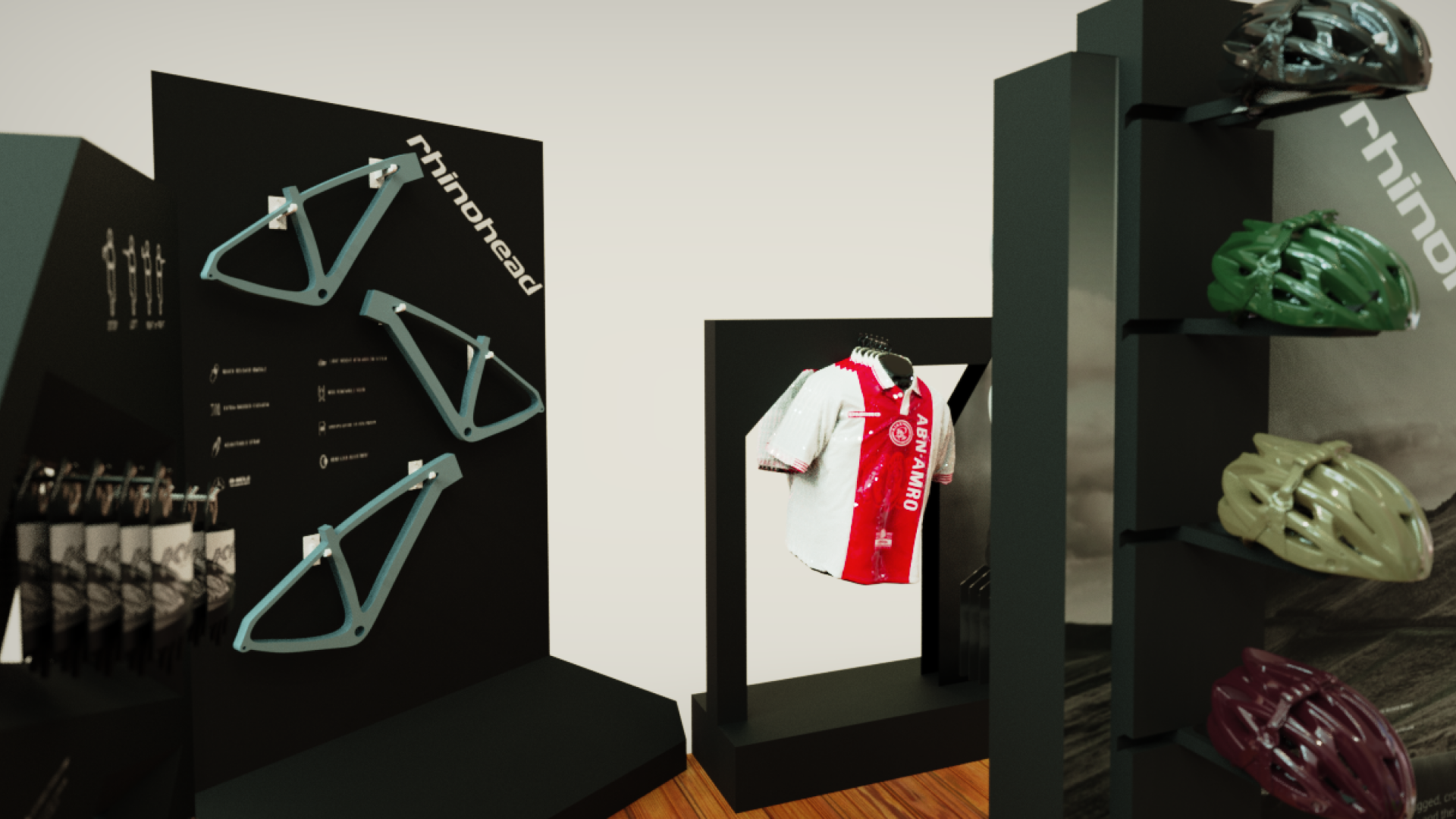
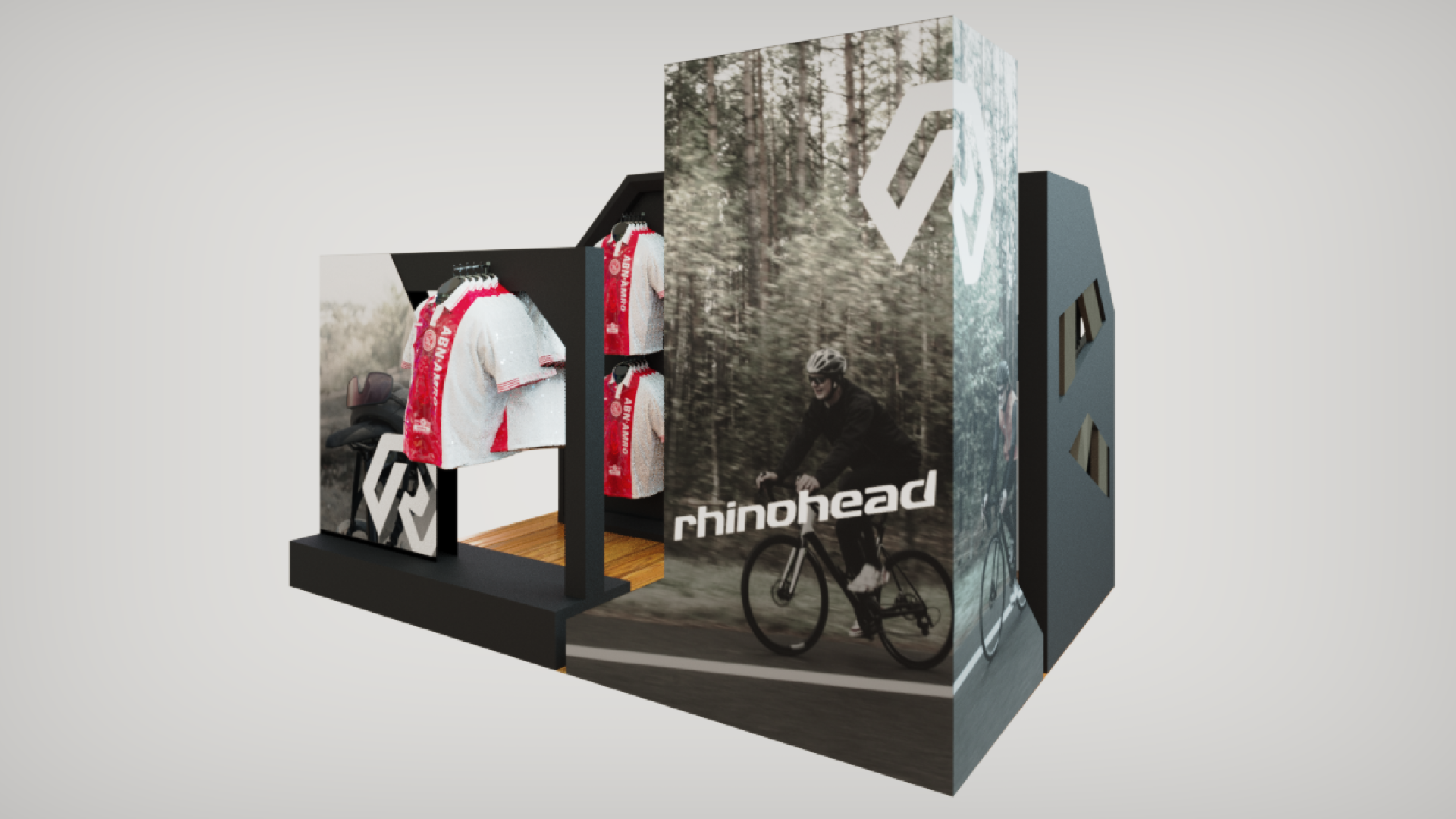
Layout corresponds to the flow of how the users may interact with the system. Ideations of the floorplan were made to be narrow the field of vision and pathway of the audience.
Visual Language

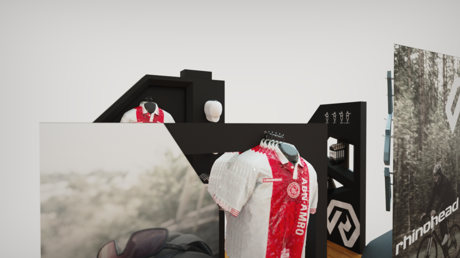
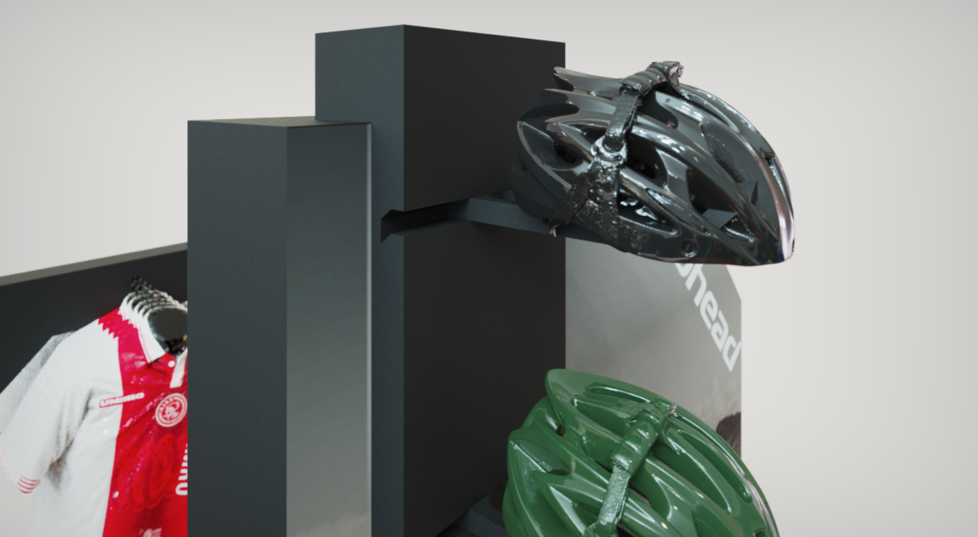
Helmet Stand
Visual language for the helmet stand, being the first component of the system made, was challenging to narrow down but I was able to come up with a sliding mechanism to hold the hook. The back side will serve as a holder of other products as well.

Glove Rack
The glove rack was to be the second component to be seen from the entrance. Therefore, it needed to be less appealing compared to the helmet stand with less visuals graphics. It makes use of a descending hanger.

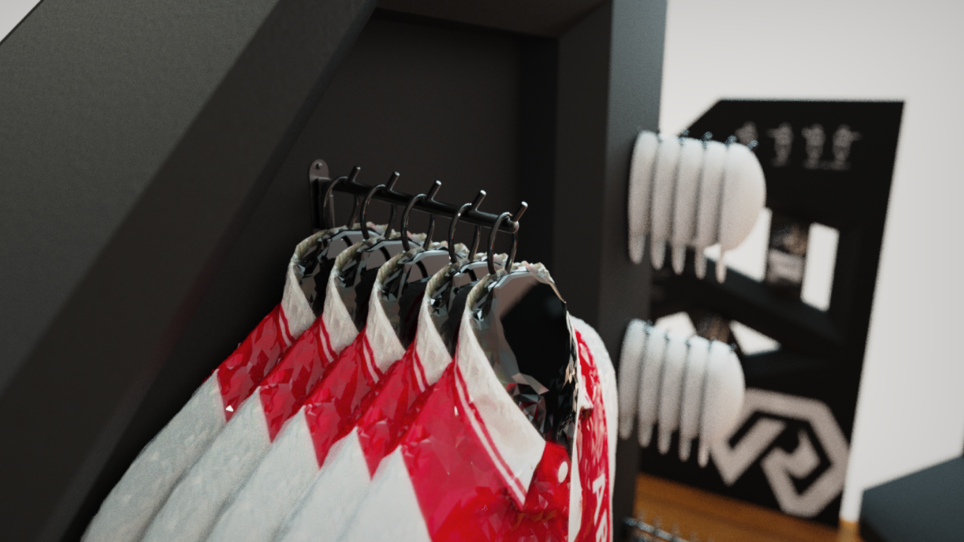
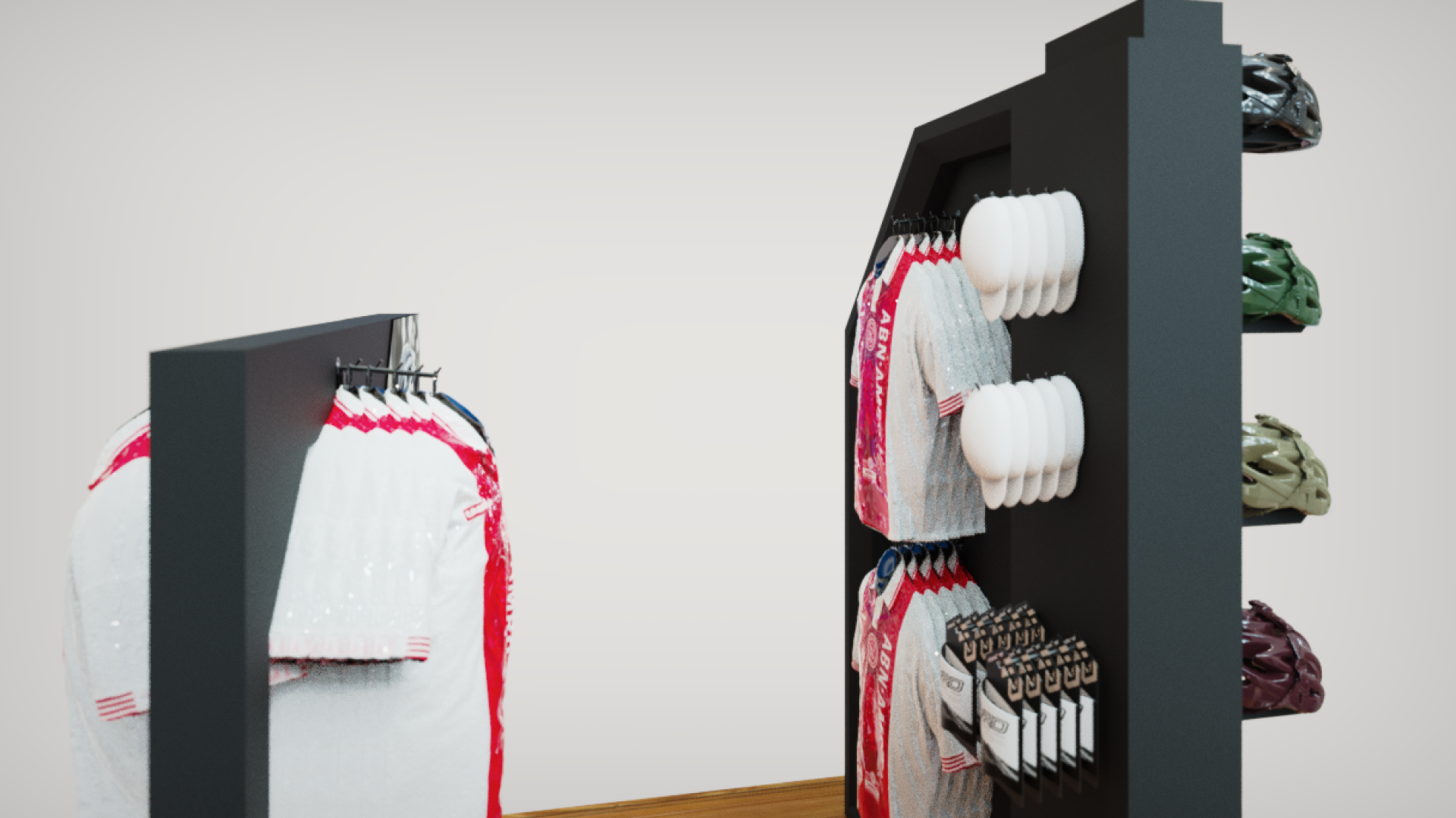
Jersey Stand
Following the visual language of the helmet stand, iterations for the jersey stand variant were made finally settling with a descending hanger and visual panels on both sides to increase product visibility.

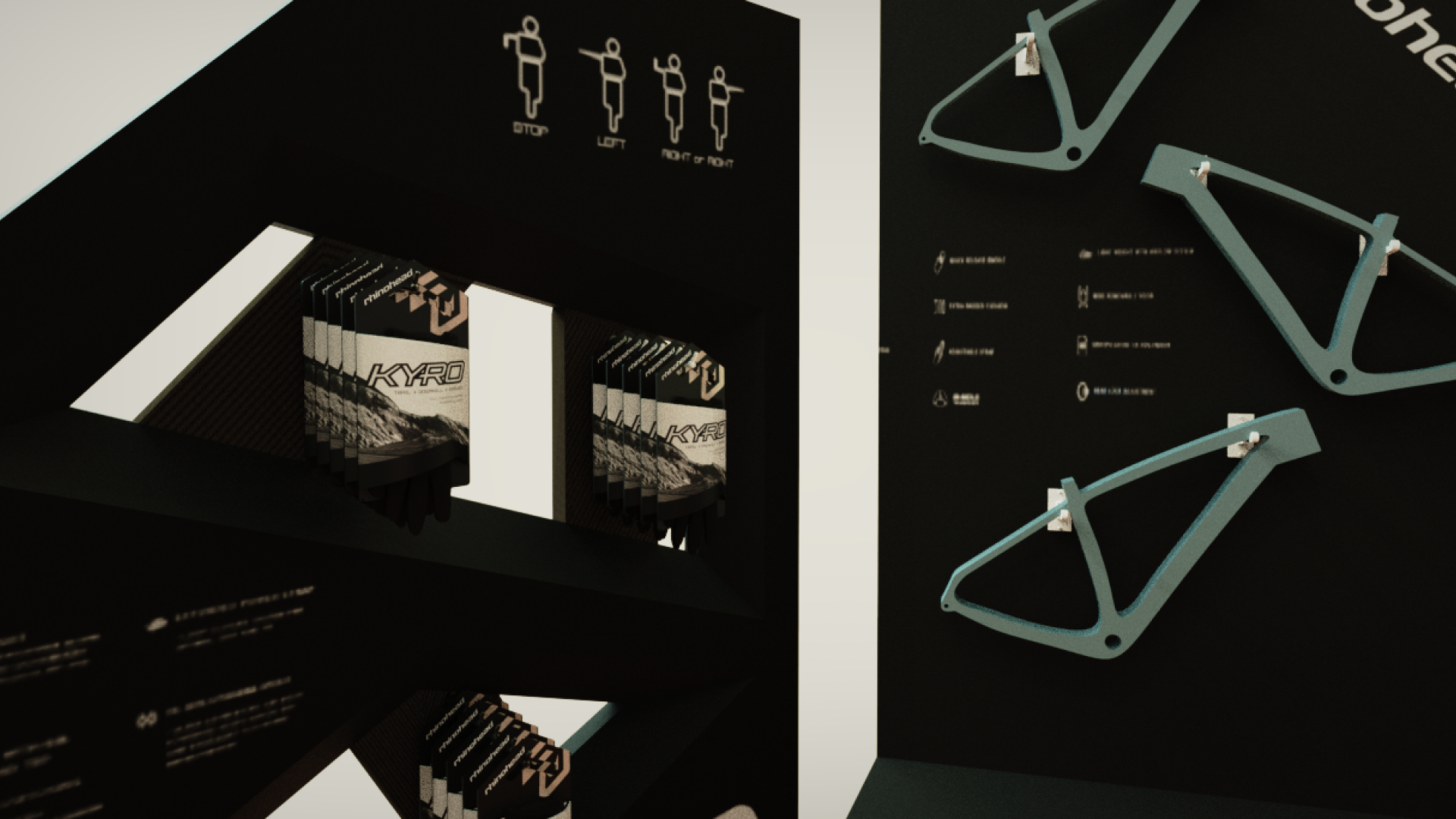
Bike Frame Rack
Hook variations for the bike frame rack were created to minimize the use of excess material.

Orthographic Views

Visual Decals

I made graphic decals to not only showcase products but educate audiences of the recreational activity.
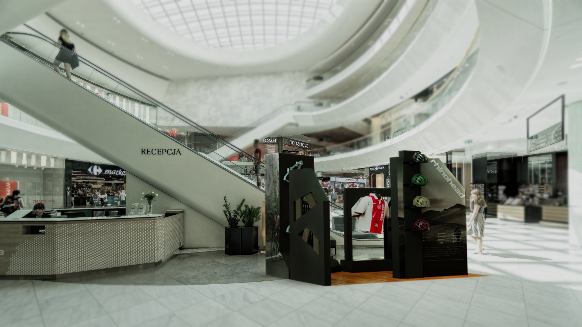
Final Design
Beginner-friendly experience
With the dedicated user flow layout and the simple visual language and graphic, the booth system is designed to be beneficial for beginners who would like to know how to get started in the recreational activity of cycling.

Get in touch.
Do you have a project or idea in mind? Send me a message.
© Erik Asia 2025. All rights reserved.