Industrial Design 

Nimble Animation Stand

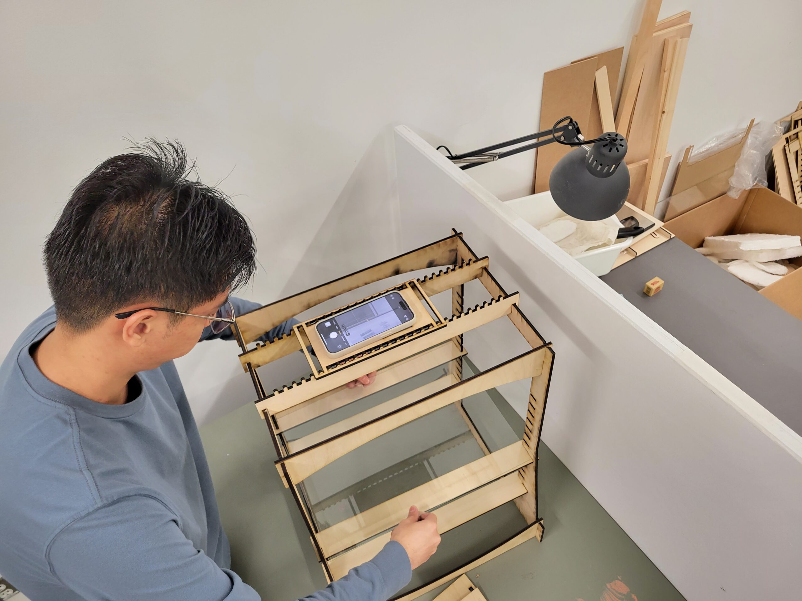
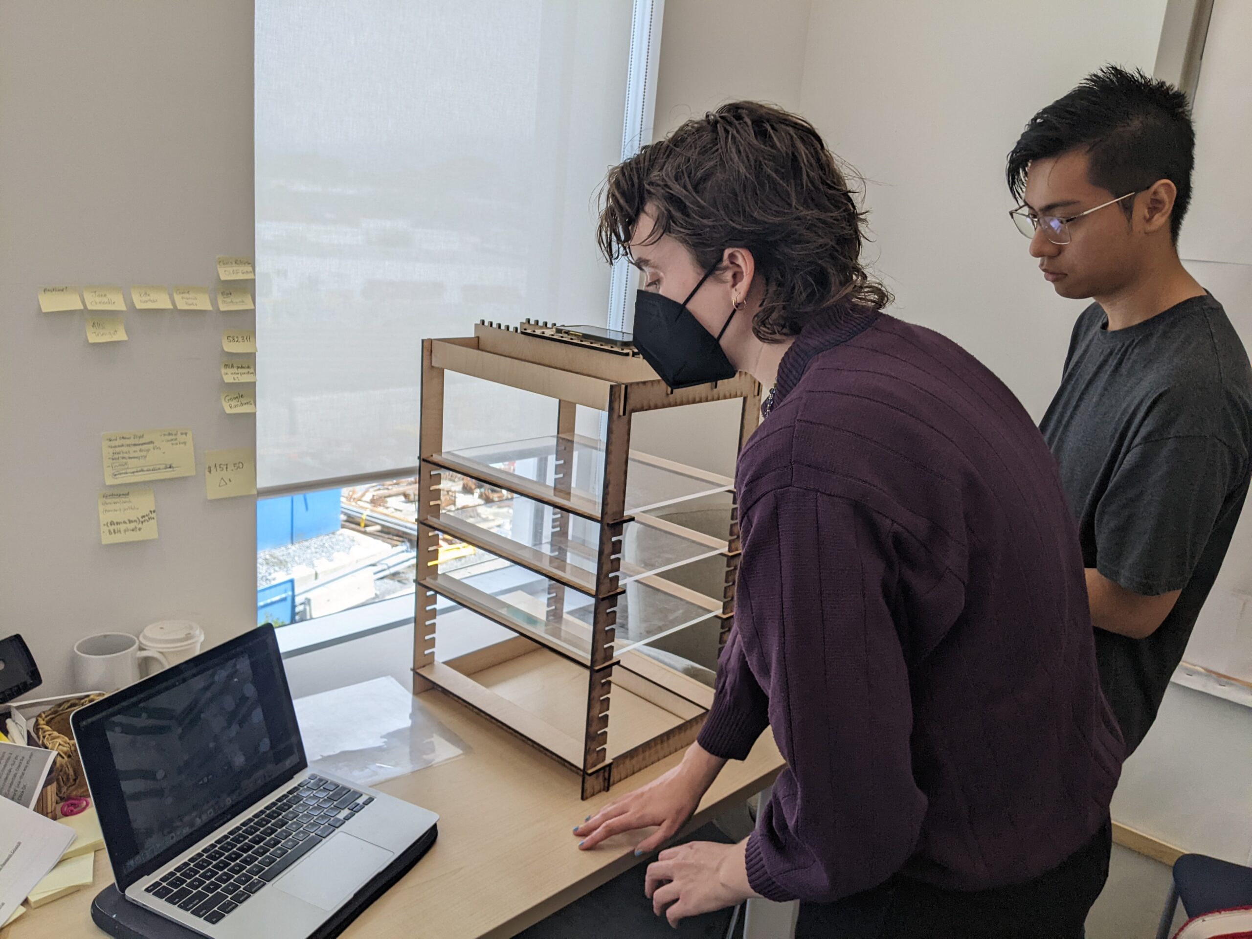
The project called for designing, fabricating, testing, and revising a modular multiplane animation stand for beginner users/enthusiasts starting to learn under-the-camera animation. It is of an iterative and collaborative nature where tests and feedback from a collaborating animation research assistant has been present throughout the project.

20231019_135548

Background

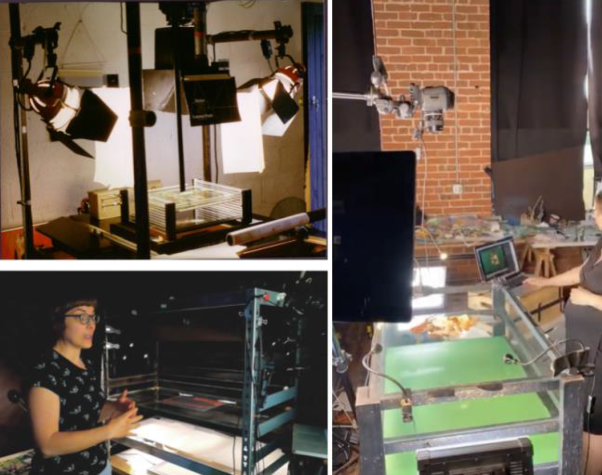
Usual industry-generated under-the-camera animation setups, making use of an animation stand, are large, expensive, and unable to be easily transferred from one location to another. Self-made animation stands, commonly consisting of lumber, hardware, and pre-made shelving units are DIY solutions to make the setup more accessible, but these are usually still fairly bulky and rigid in utility, commonly having a fixed configuration and unable to be easily disassembled or altered.

The Challenge

The design and prototyping of the proposed multi-plane animation stand is to be easily replicated, easy-to-use for artists from non-animation backgrounds, and is portable and suitable for outdoor use and travel.

How might we design an easy-to-assemble, modular, and portable multiplane animation stand for people starting to learn under-the-camera animation?

Process

An initial meeting was held where the gaps of the existing DIY methods for constructing a self-made multiplane animation stand as well as project design considerations were identified. The stand is to be used with smartphone cameras and small DSLR cameras in mind. It is to be consisting of three to five layers for planes.

To address the objective of the stand being easily replicated, I proposed for it to be entirely digitally fabricated through laser cutting plywood. This was to provide users access to the open source vector files and material requirements that are of standard sizes in hardware and art stores. This would also provide sufficient constraints in construction of the stand to allow for modularity that would aid in making it portable and easy to assemble.

An iterative process was used to develop the design through constant prototyping and testing in collaboration with the animation research assistant in the project who used the designed stands to make under-the-camera animation works.

Design

Prototype 01: Testing the general mechanism

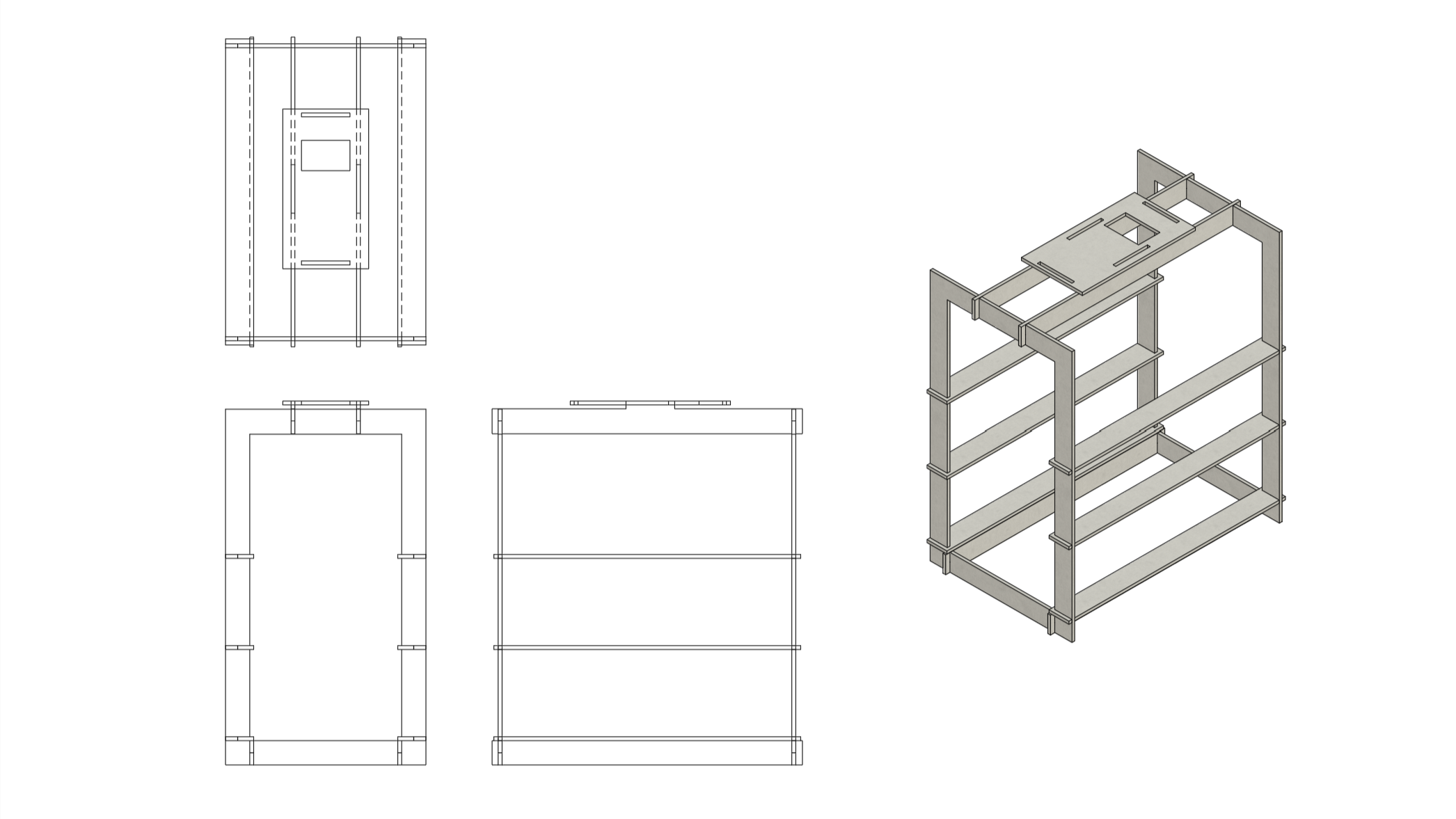
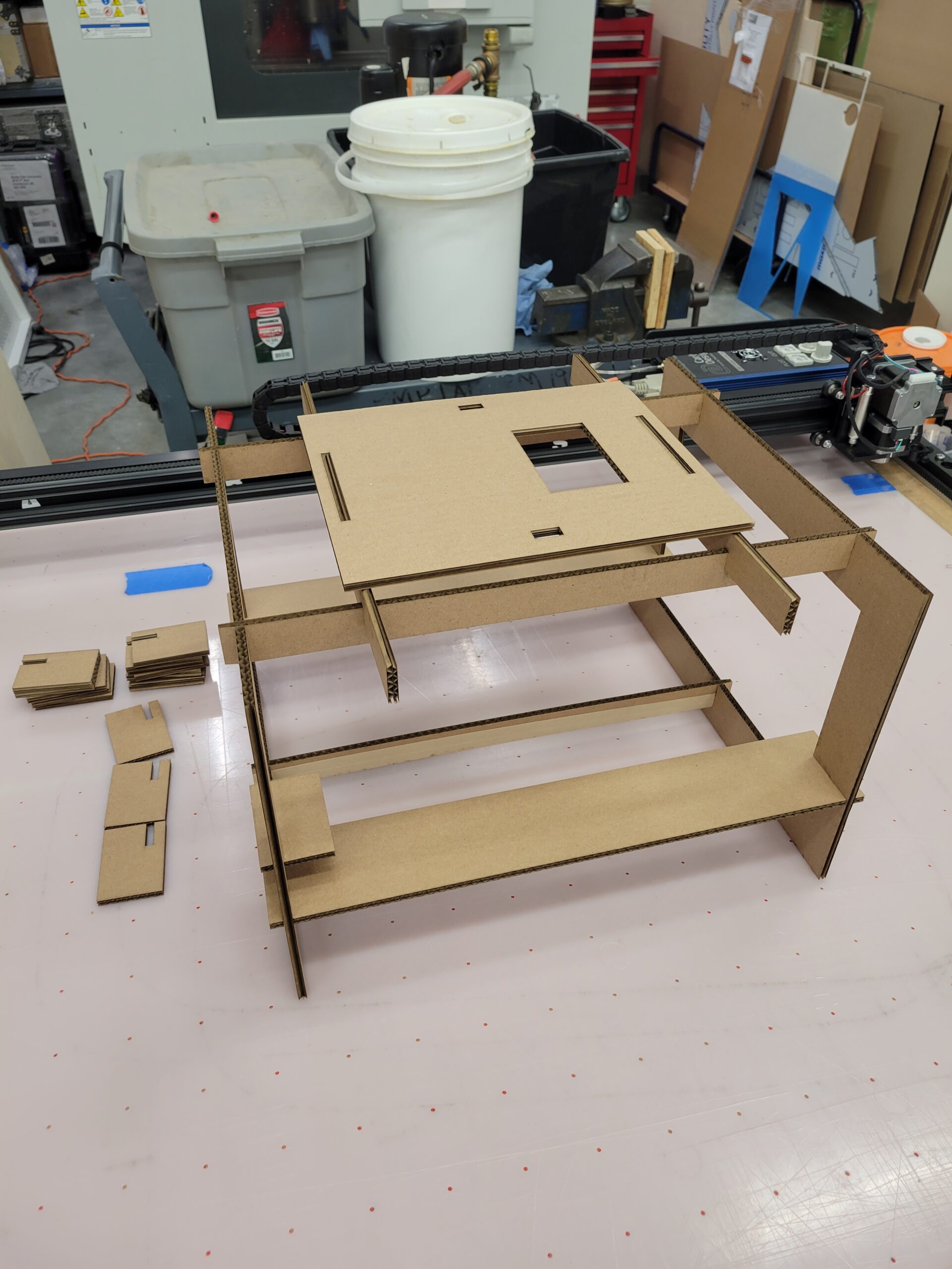
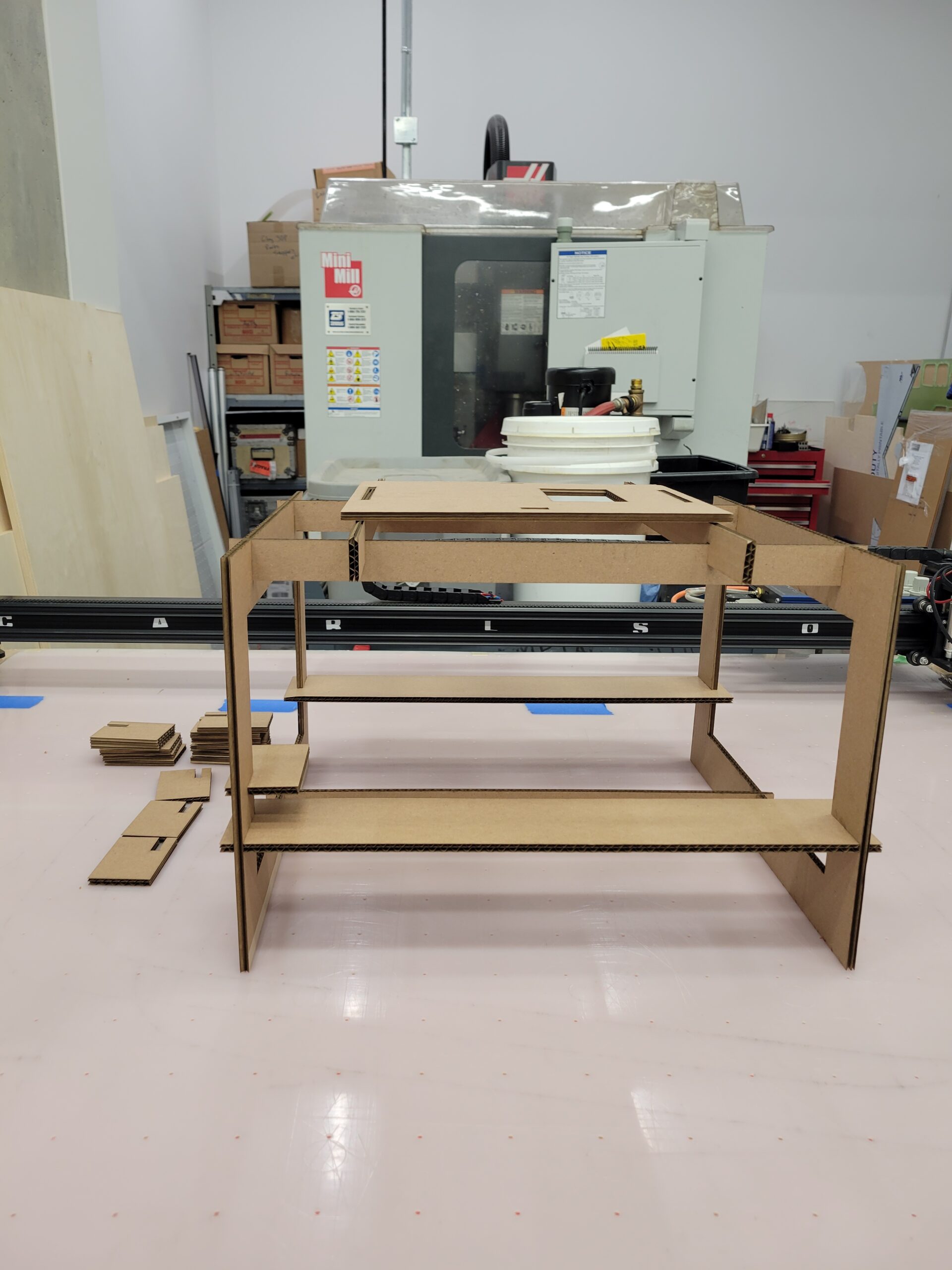
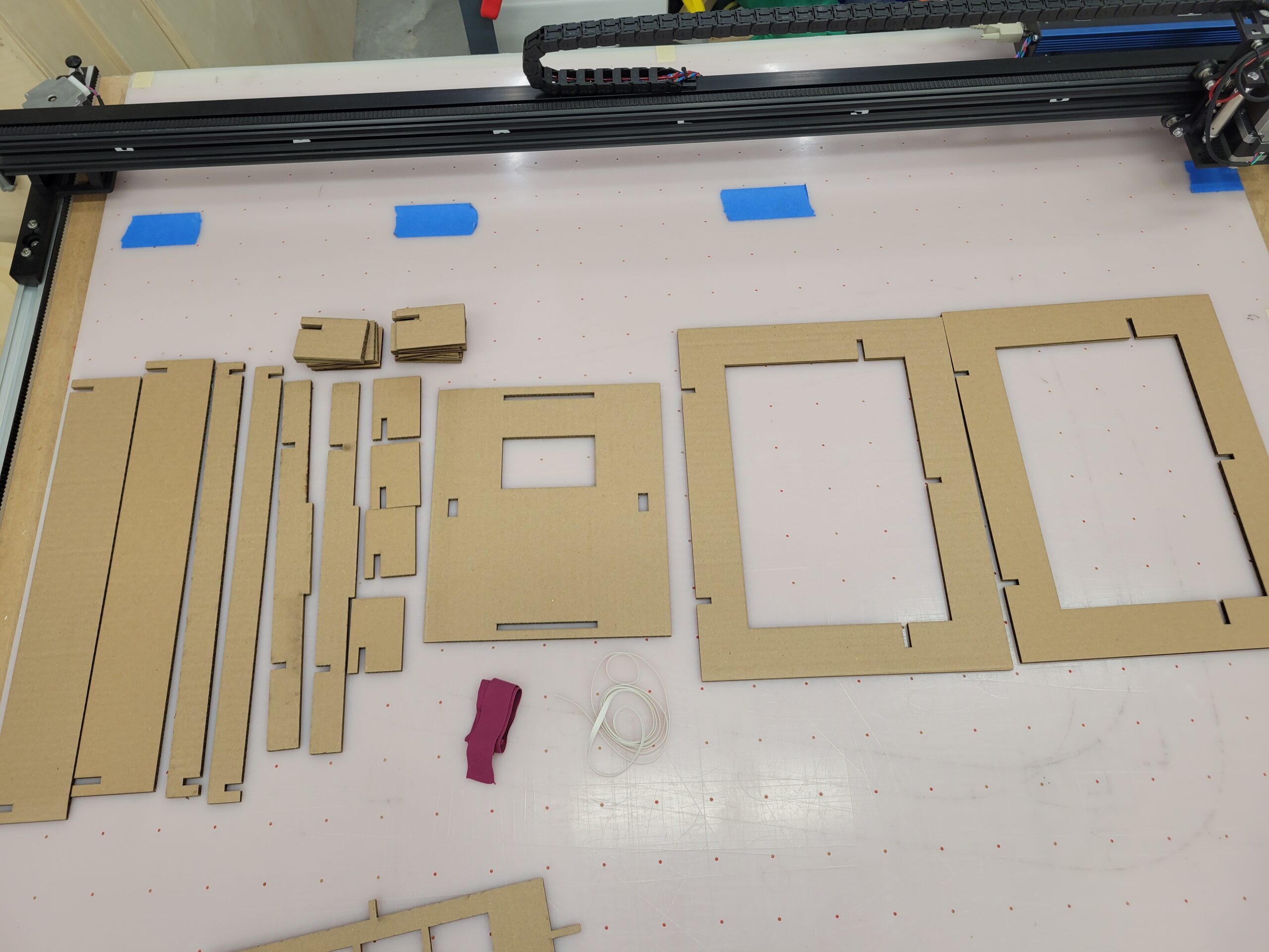
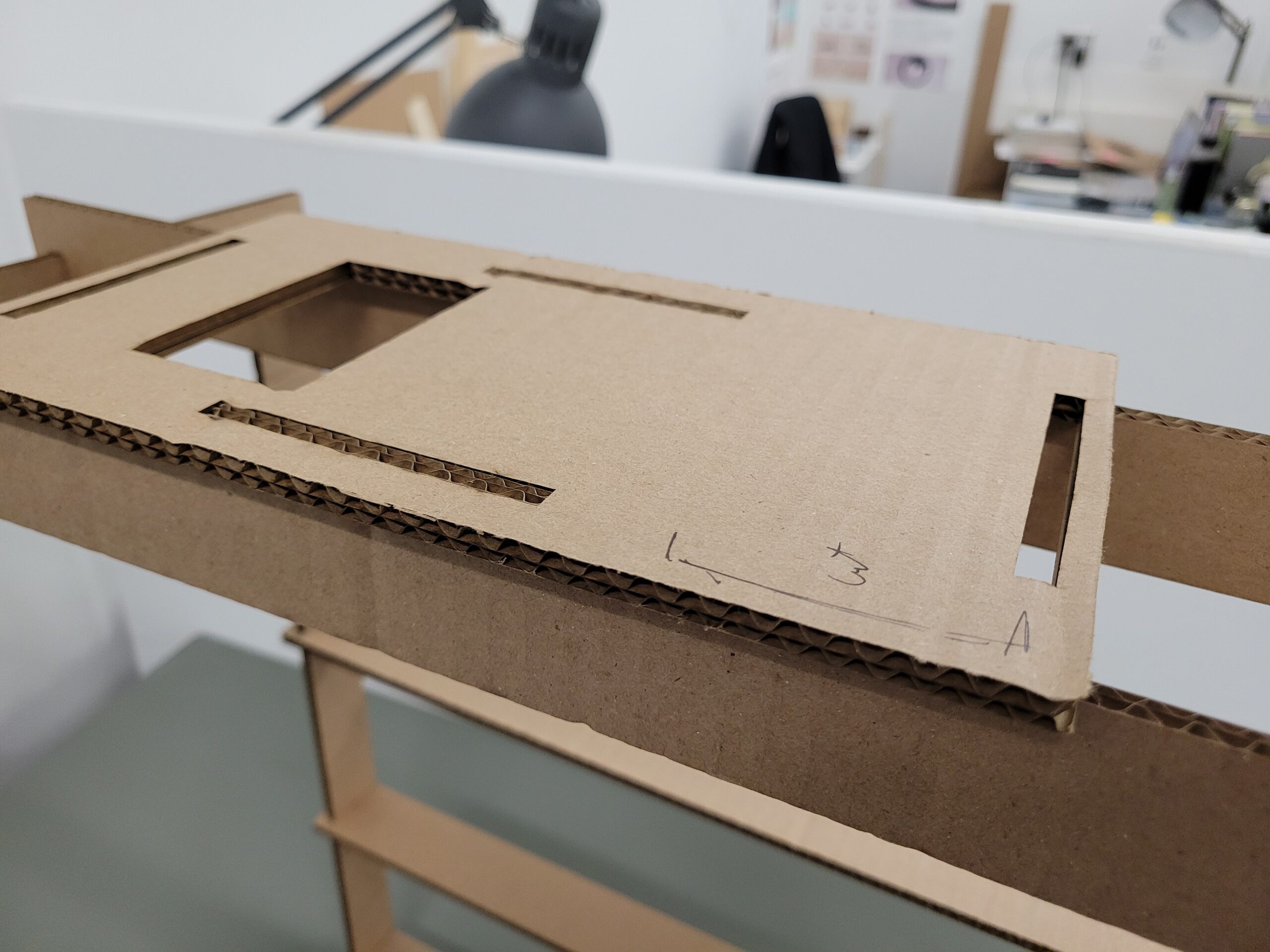
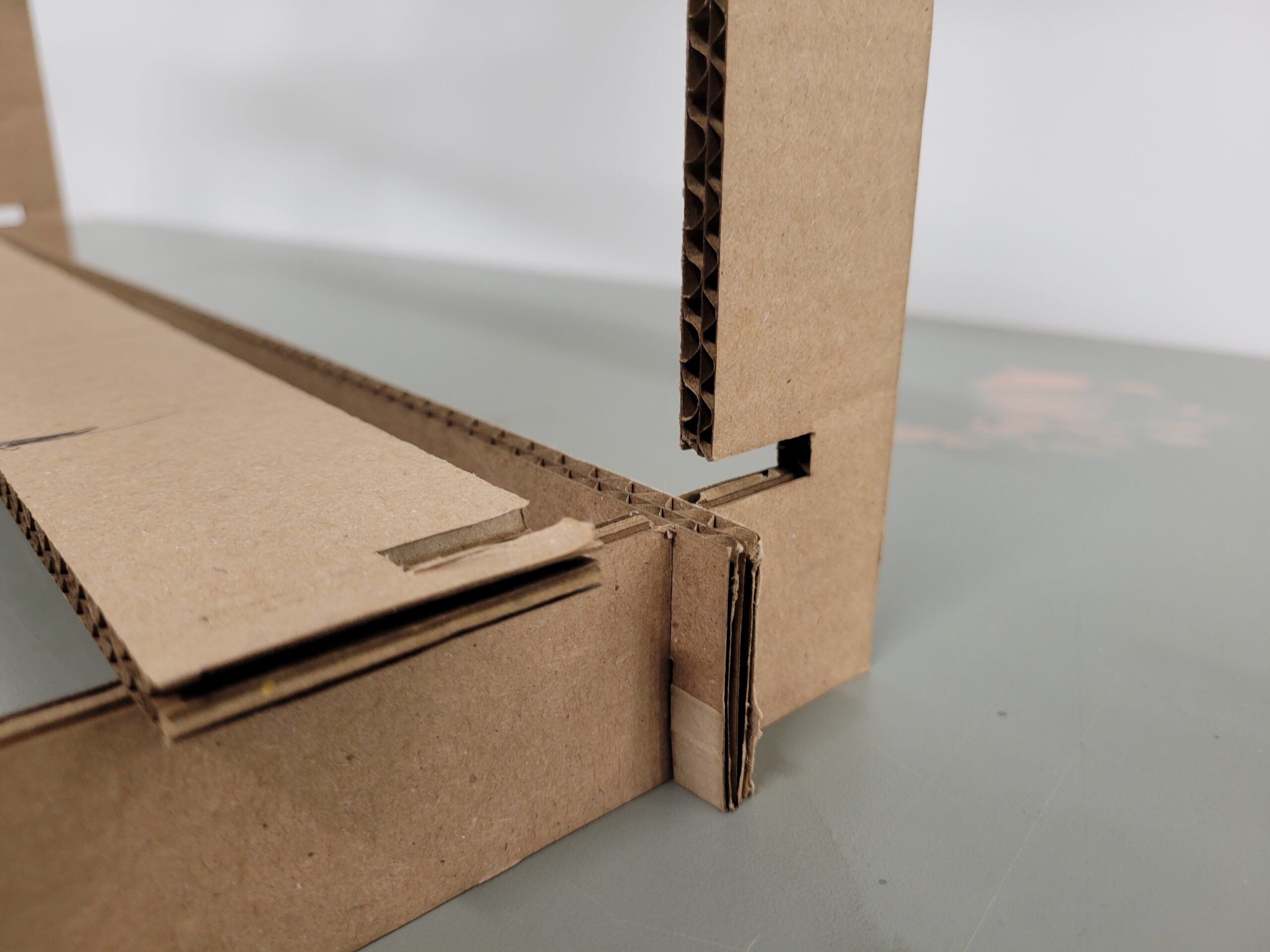
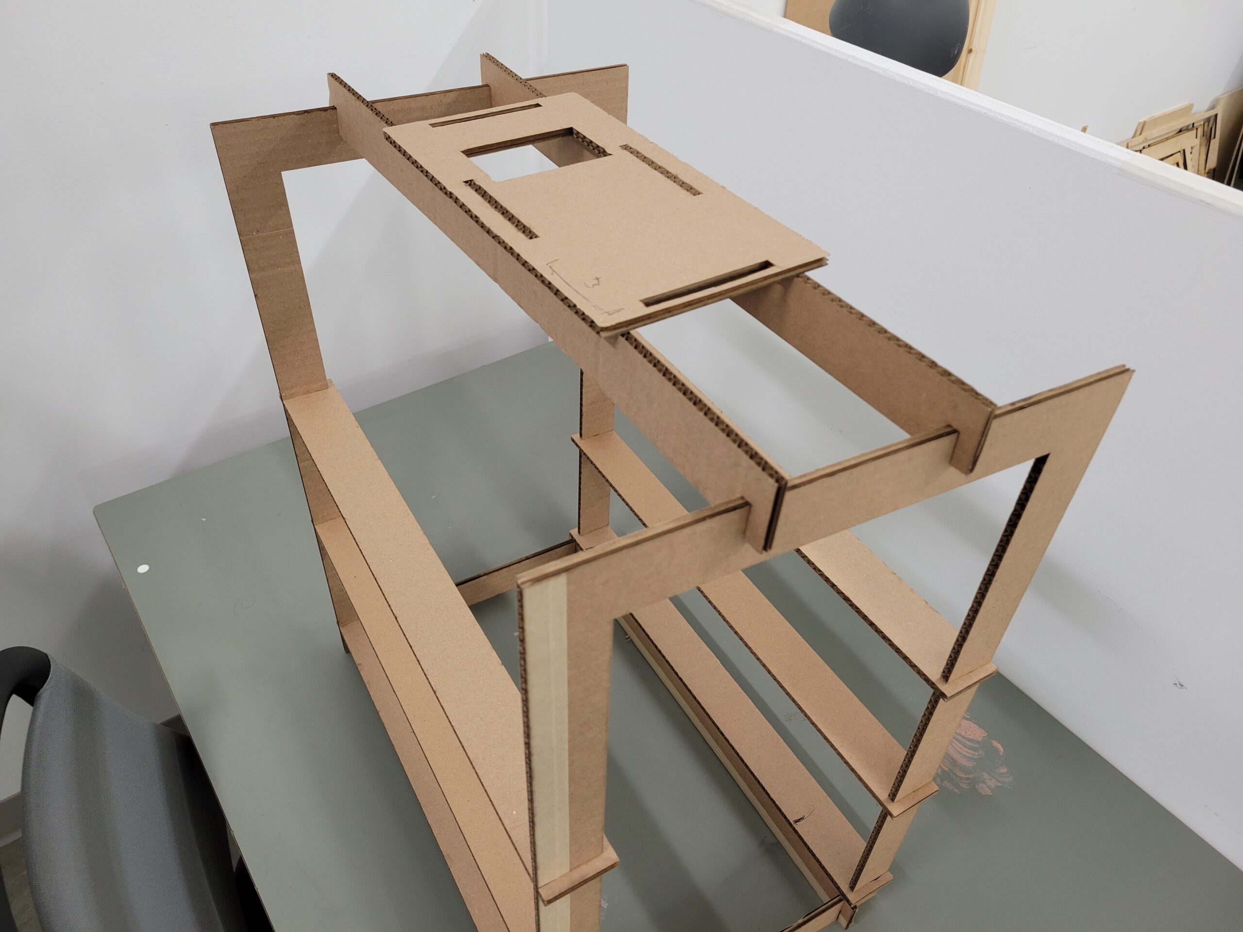
A cardboard prototype was made using ¼ in corrugated cardboard. This was to visualize and materialize the general form of the stand being developed. This consisted of a frame, structural braces, and one beam for a glass plane to be placed on top of.

20230626_120102
20230626_121221
20230626_121216

A cardboard prototype was made using ¼ in corrugated cardboard. This was to visualize and materialize the general form of the stand being developed. This consisted of a frame, structural braces, and one beam for a glass plane to be placed on top of.

The first prototype served to experiment with the general mechanism the design would be following. It was designed with a single level which can be replicated vertically to accommodate whichever number of plane layers would be required in succeeding versions.

PXL_20230706_181151241
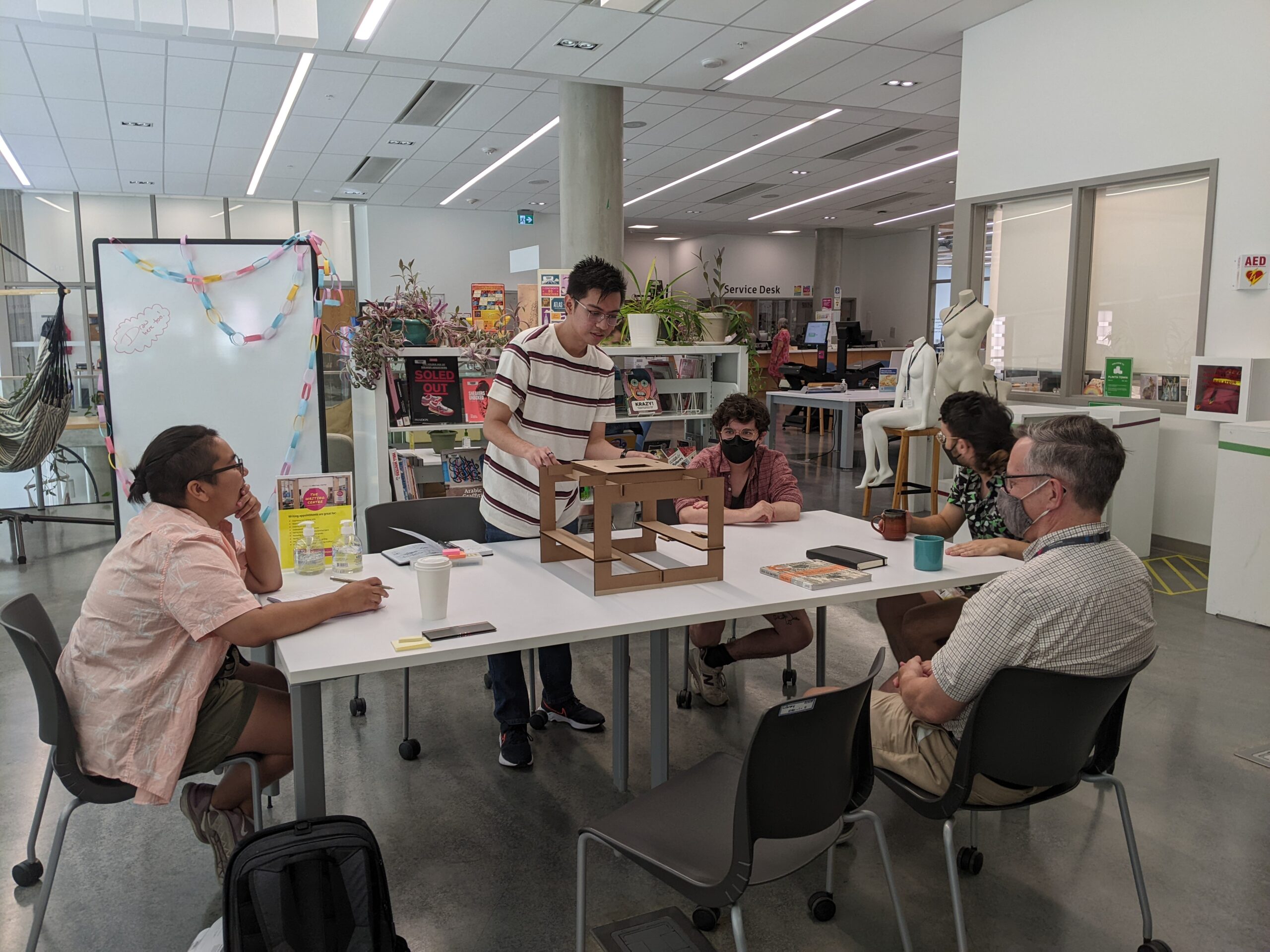
Feedback session with animation specialists for first prototype.

The prototype was assessed in a meeting with the group and feedback was given.

  • The beams that were supposed to hold the glass planes were too broad and minimized the work area available at the center of the setup.
  • The center structural brace was also in the way for overall camera viewing angle from above. To heighten stability and to not disrupt the view of the camera in the work area, it was advised to put individual beams on the corners of the frame.
  • The phone holder was also too broad and could be reduced in scale. There was an emphasis on sleekness and minimizing unnecessary parts to reduce bulkiness and potential weight when carrying it from one location to another. With this, a survey of phone sizes, focusing on the camera modules, was briefly conducted to get a sense of general measurements needed for the phone holder in the stand.

Prototype 02: Designing to scale

A second iteration was made still using cardboard, this time to scale with three layers where glass planes may be placed to use the stand. The phone holder was greatly reduced in size, catering to most phone sizes. An additional feature of being able to rotate the phone holder either in portrait or landscape modes was also added in order to switch orientation of shooting modes. Structural support braces were added at the corners of the bottom of the frame, and removed on top to minimize parts as the structure was to be kept in place by the beams as well.

20231019_170332
20231019_170337
20231019_170416
20231019_170343
20231019_170457
20231019_170442
PXL_20230724_210639035
Feedback session for the second prototype.

Upon evaluation, the decision to remove the top braces resulted in stability issues. It was greatly encouraged for further iterations to have support braces on corners both on top and bottom of the frame. The flushed insertion of the beam to the frame was also a bit short to support potential glass planes to be laid on top of it. Certain measurements were marked to reduce the length of the beams in accordance with the 16:9 aspect ratio of shooting. It was also recommended to have an option of height manipulation for the beams holding the glass planes to allow for flexibility of shooting distance to subject.

Prototype 03: Designing to test in field

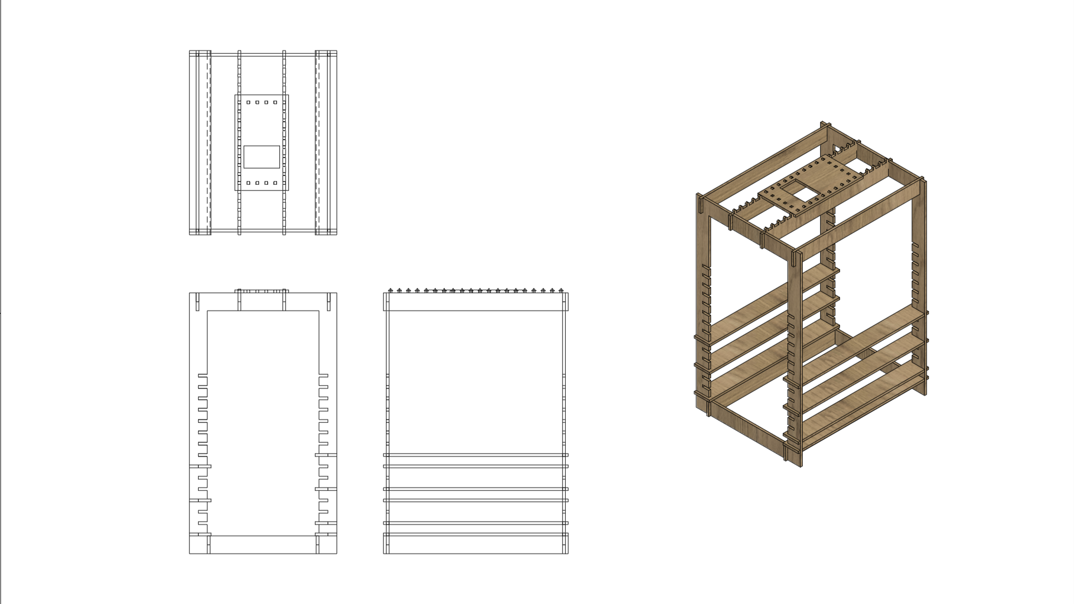
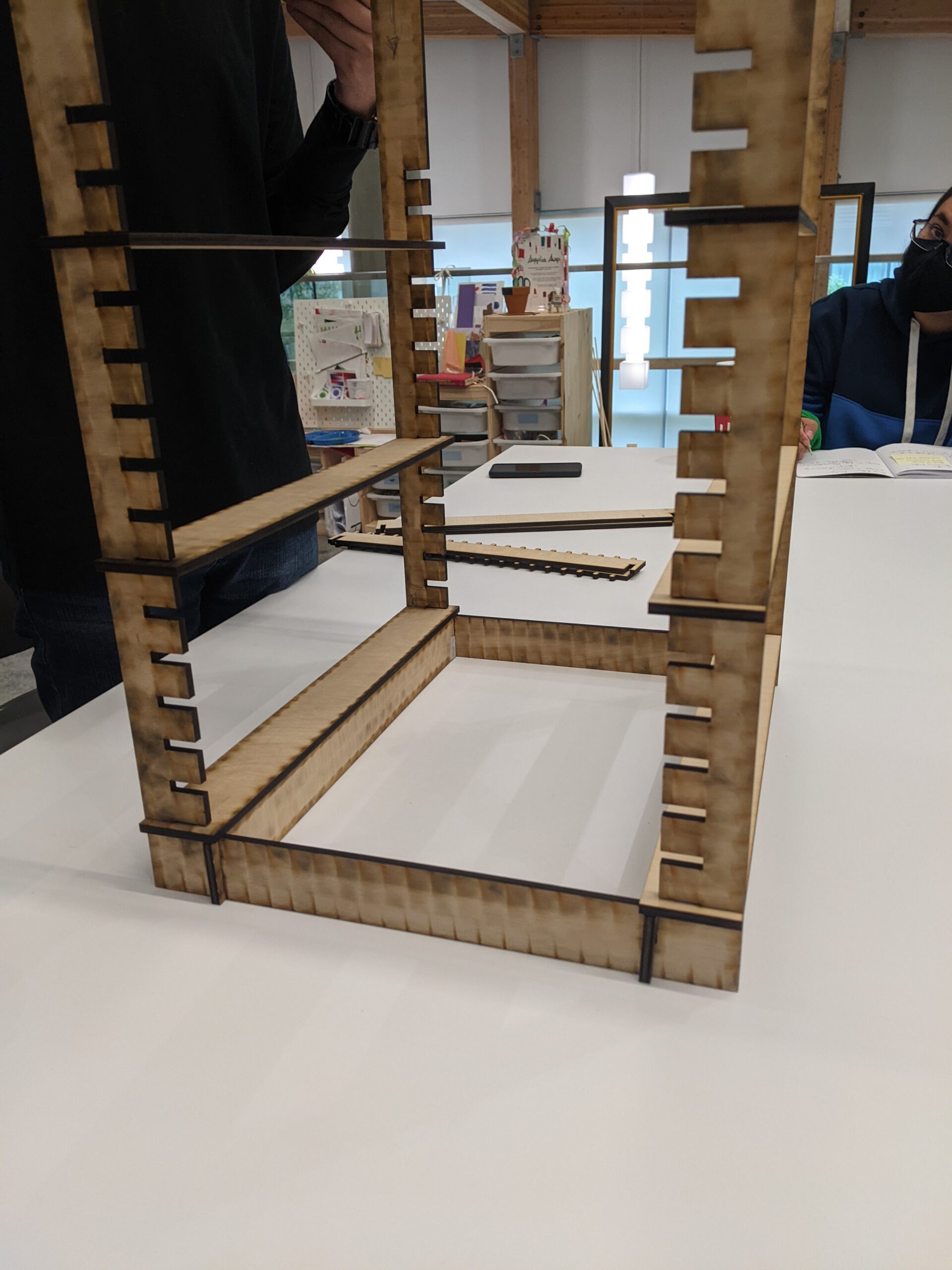
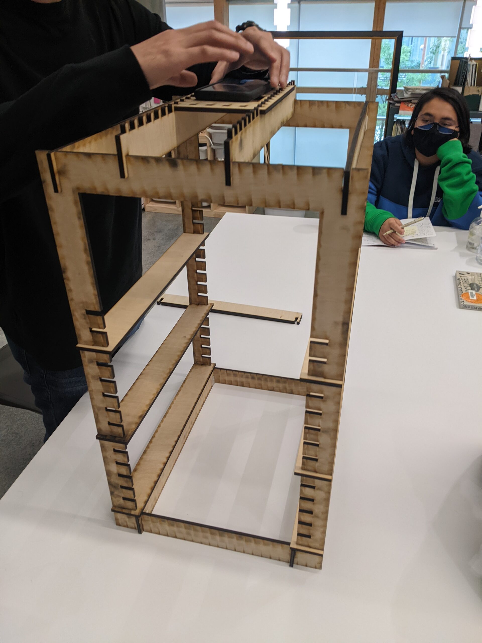
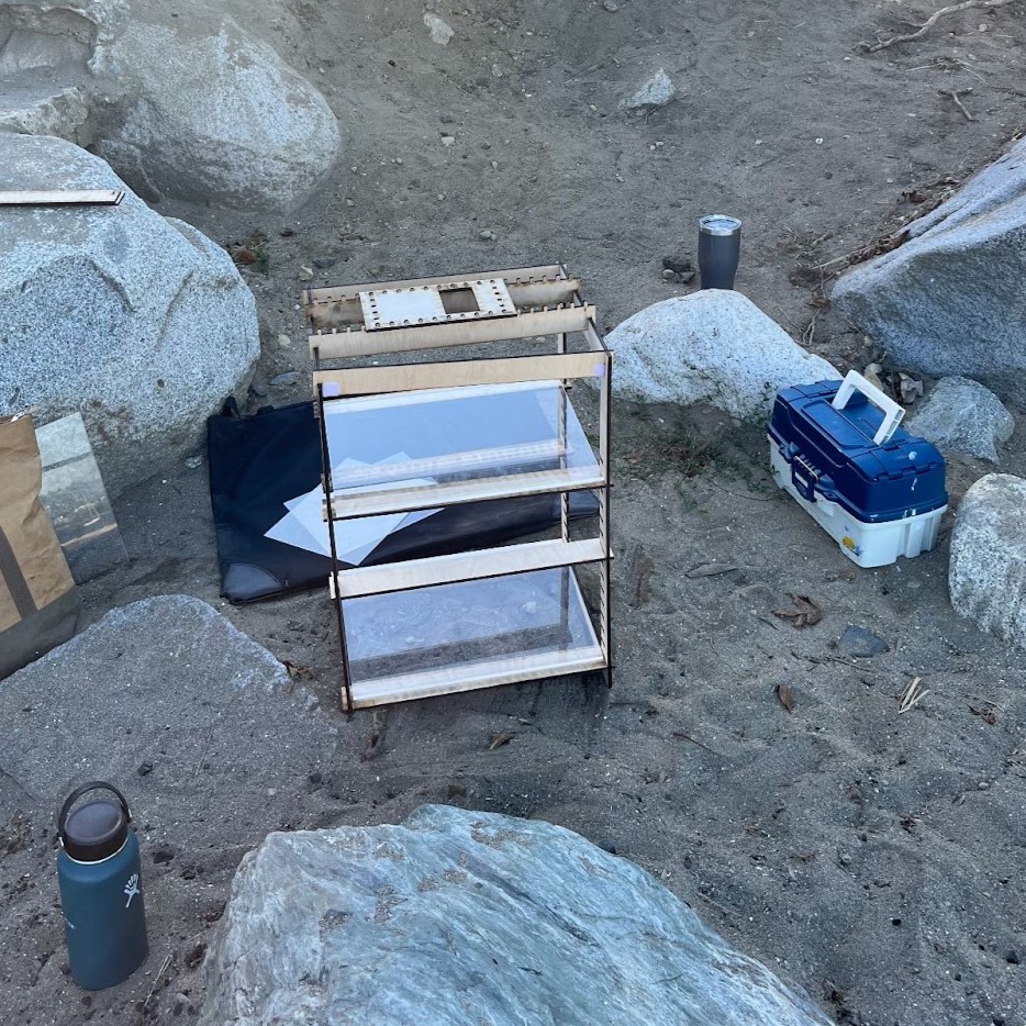
The third iteration was finally laser cut using ¼ in plywood. It had mostly retained a lot of the structural components of the second iteration. A set of fifteen 1 in slots for the beams were added to have versatility and flexibility in height adjustments of layers. Support braces were also added on the top corners. The phone holder was perforated with slots that affixed in the redesigned connecting beam to the frame, this time having ridges that fit the slots on the holder. The flexibility of the pattern allows for different orientations, both portrait and landscape. It is the first prototype for user testing.

MPAS_V3Assembly-01
PXL_20230724_211000141
PXL_20230724_211701330
PXL_20230810_190921557
PXL_20230724_210639035

Feedback from using the stand consisted of the following:

  • There was difficulty in fitting beams from one frame to the next without any form of indicator to acknowledge the beam is leveled.
  • Due to the similarity in braces and beams, it was also difficult to ascertain which parts are which with no visible differentiation.
  • Fitting of the phone holder was also too rigid because of the precision required to fit the ridged beam onto the slots on the holder. This made transferring from peg to peg challenging and time consuming.

However, the greatest concern in using the stand was its constant swaying and stability issues. This would be in relation to the sleek profile and loose tolerance of the joineries.

Tolerance Test

Due to the main issue of the stand being too wobbly, a tolerance test was made for the fitting of the joineries. This was conducted with the assumption that with more material friction between parts, it would hold more rigidly and prevent loose spaces in between joineries. With this, a series of offsets were made in increments from -0.3 mm, -0.2 mm, -0.1 mm, 0 mm, 0.02 mm, 0.1 mm, 0.2 mm, 0.3 mm, 0.4 mm, 0.5 mm, 0.6 mm, and 0.7 mm.

VideoCapture_20231023-105854
20231019_175626
20231019_175747

The testing resulted in the use of a 0.6 mm tolerance for both parts to achieve a snug fit. However, upon testing in the actual prototype form, it was found that the tolerance was tight enough to hold the overall parts together without much wobble, however, it was too tight to disassemble. Thus, further testing was conducted and a combination of one part being 0.5 mm and the other being 0.6 mm tolerance was found to be best for a rigid snug fit for both assembly and disassembly.

Prototype 04: Designing from user feedback

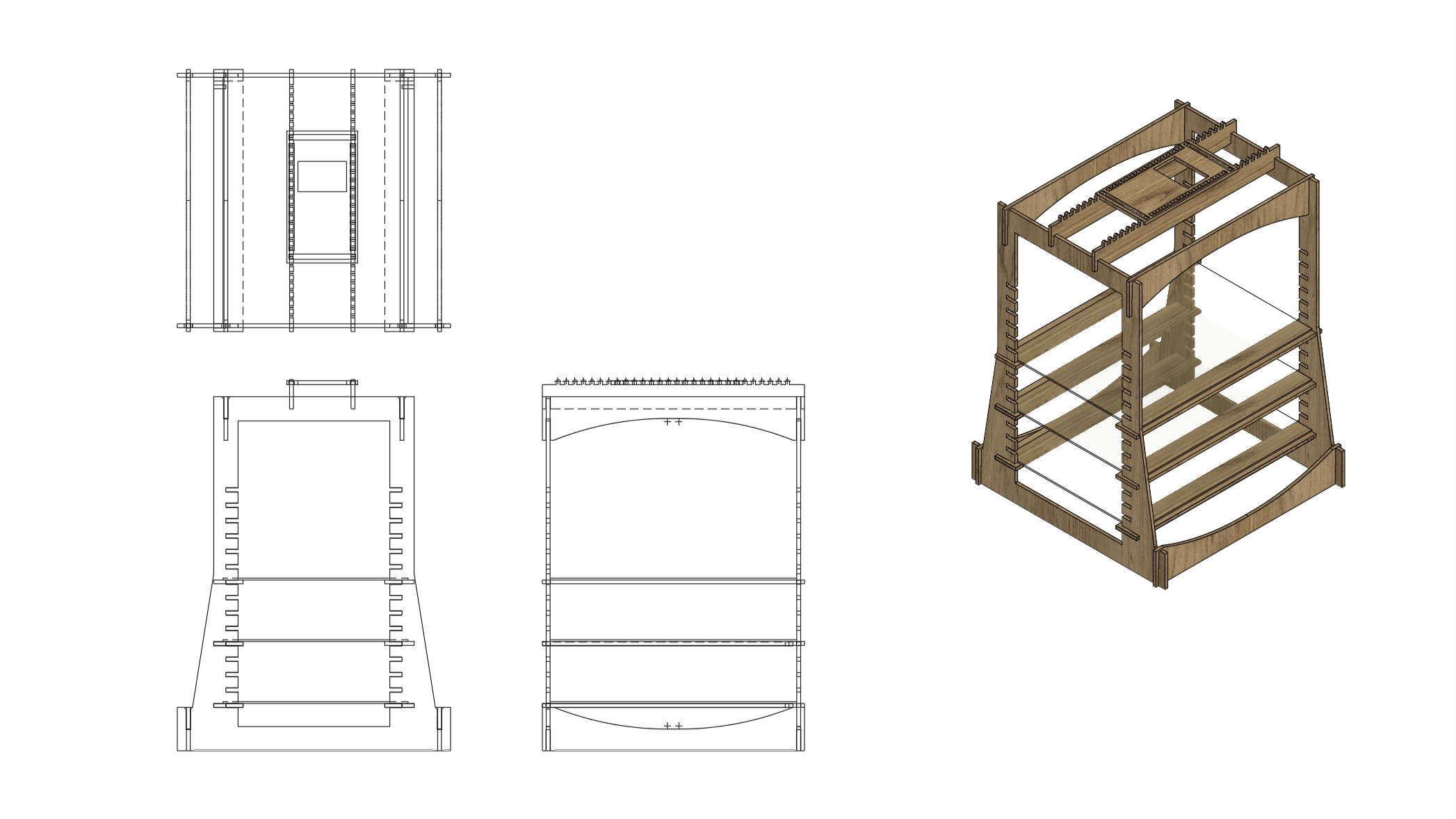
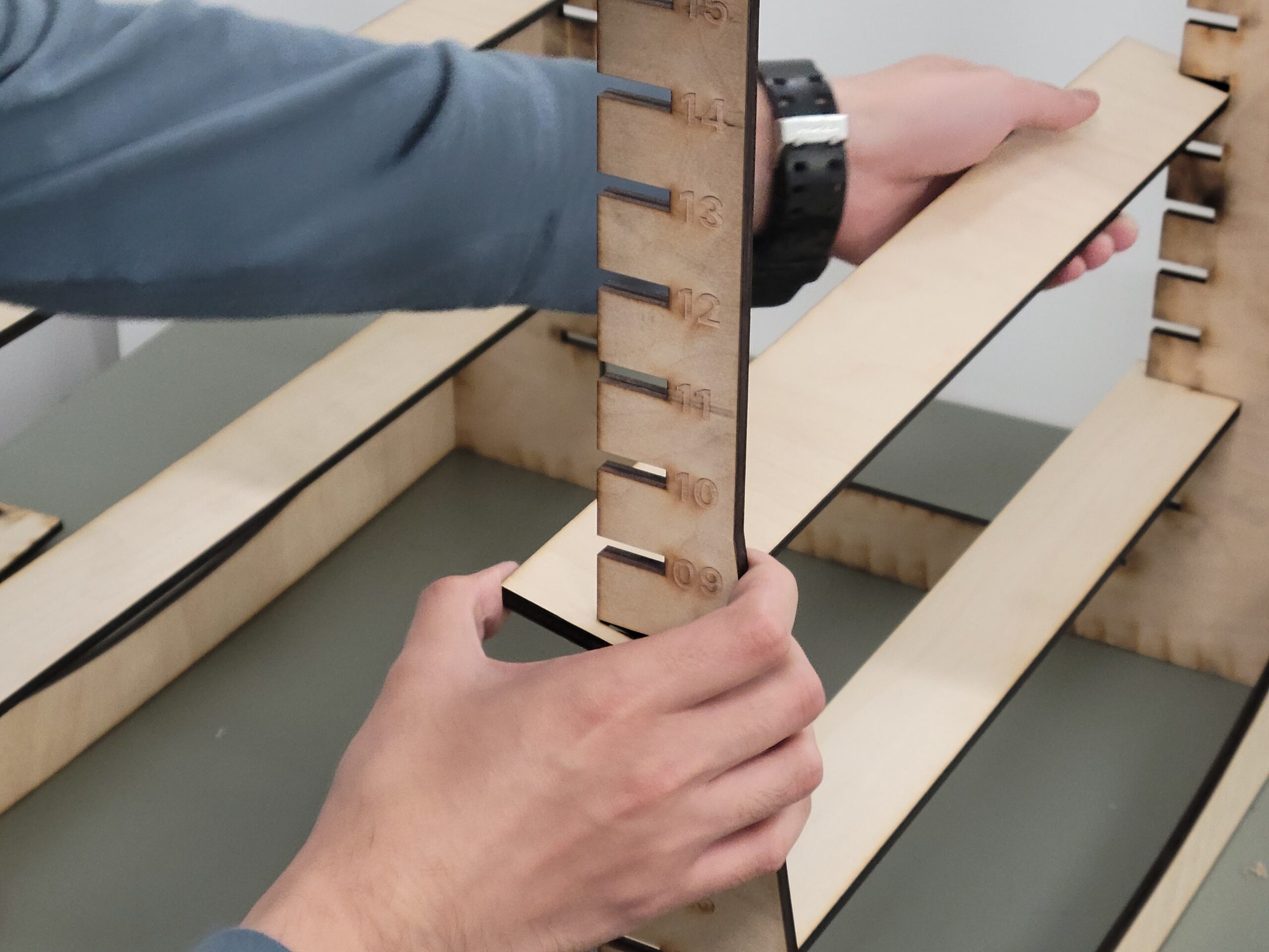
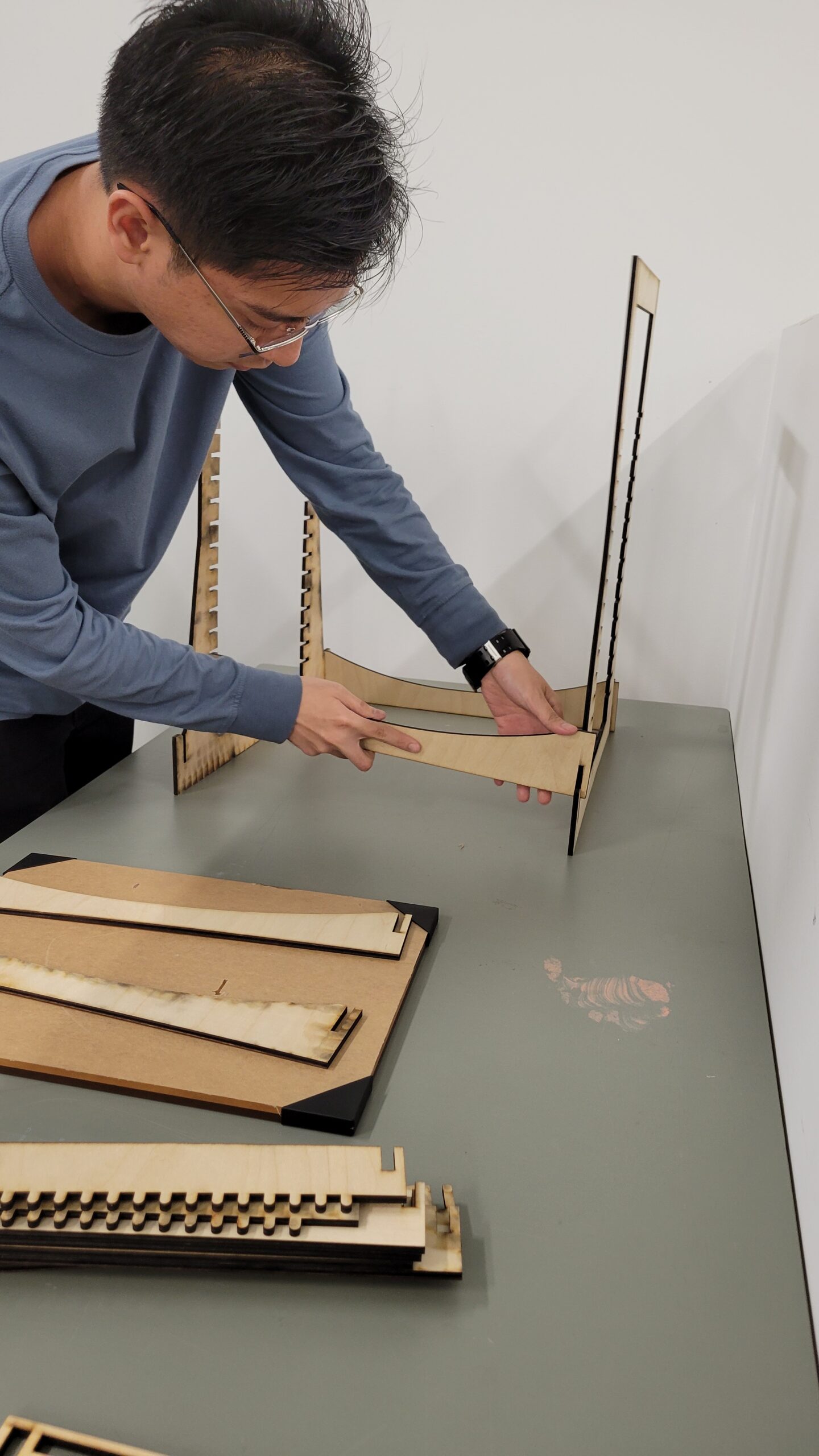
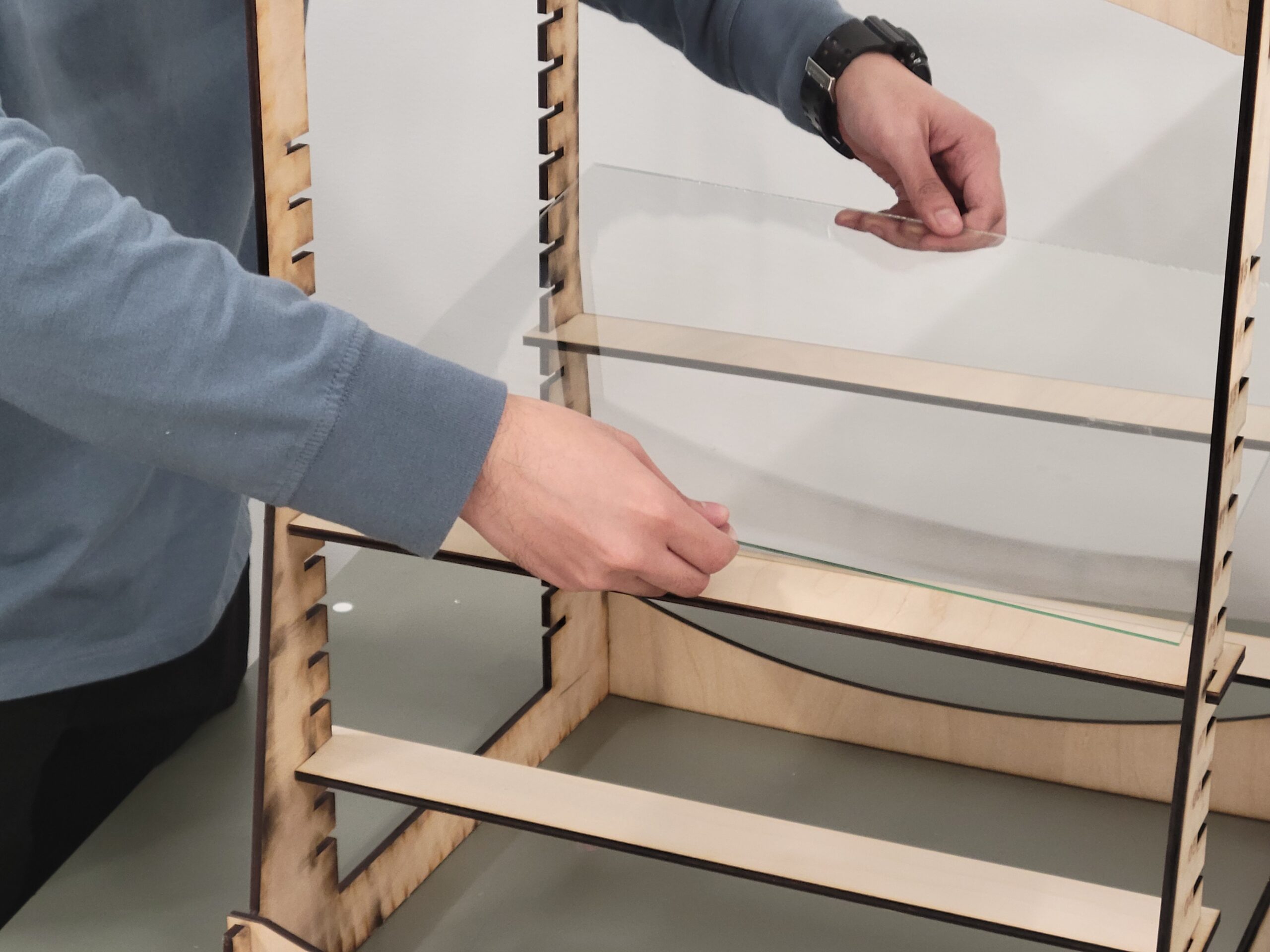
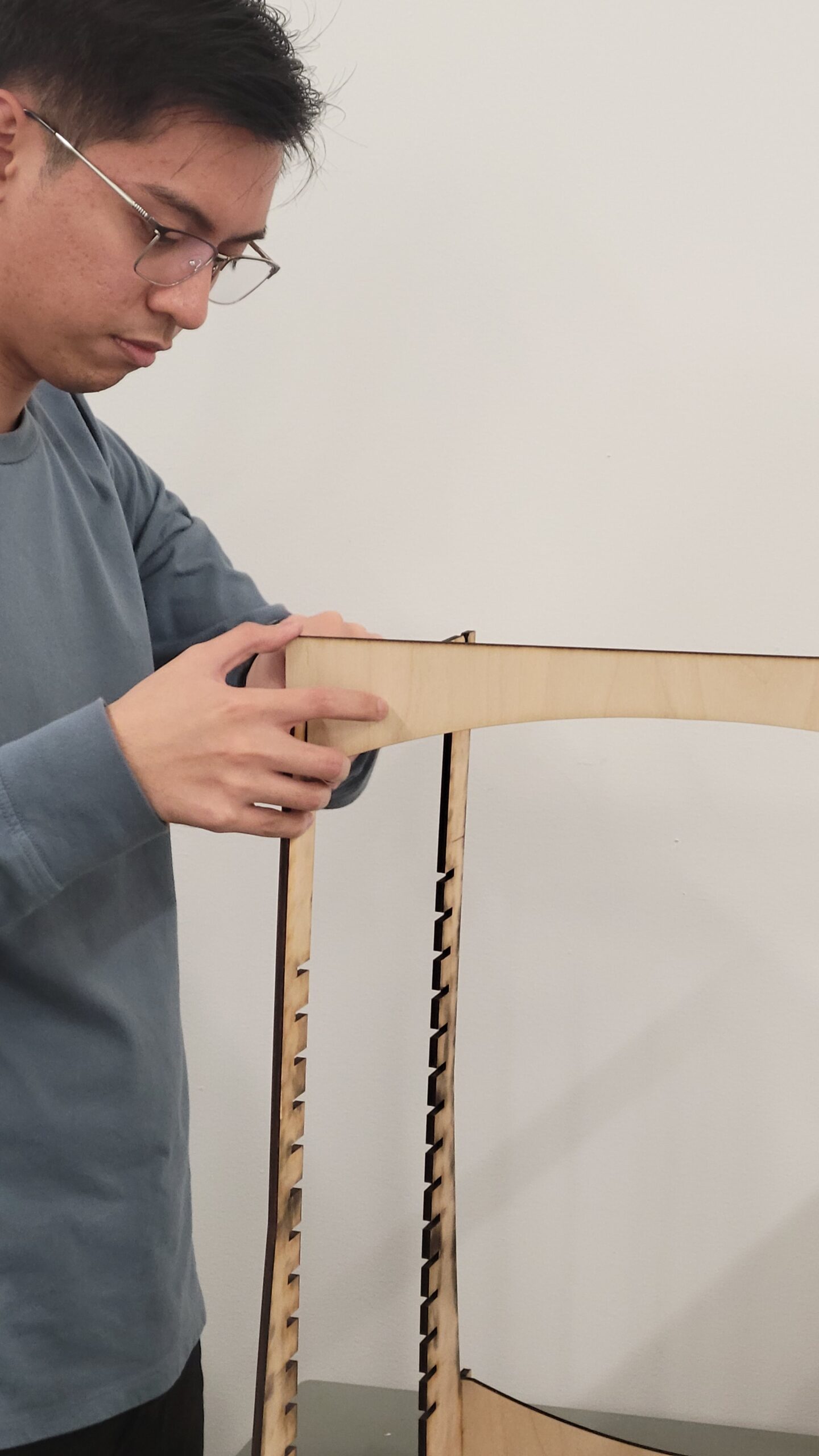
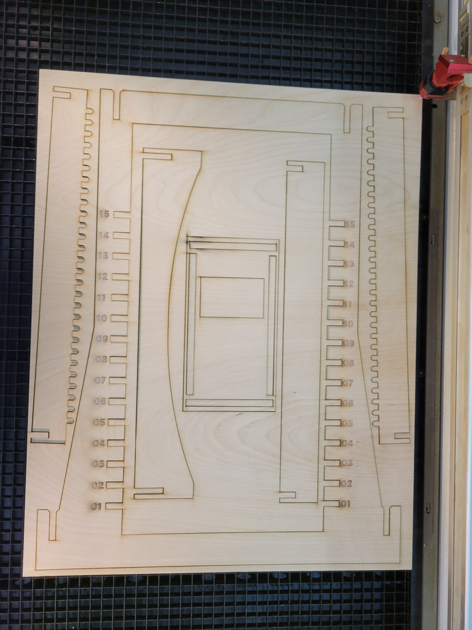
The fourth prototype focused on enhancing stability of the previous iteration. It was laser cut using ¼ in plywood same as the previous. In this iteration, a wider base was made by tapering the frame. The structural braces were also curved to denote whether it was for the top or bottom as well as to differentiate them from the beams, which were remarked to be very confusing from the previous prototype. To enhance the user experience of affixing beams, numbered markings for each increment 1-15 were engraved to identify whether the beams are leveled on both sides of the frames.

PXL_20230810_192439821
20231012_113454
20231016_155028

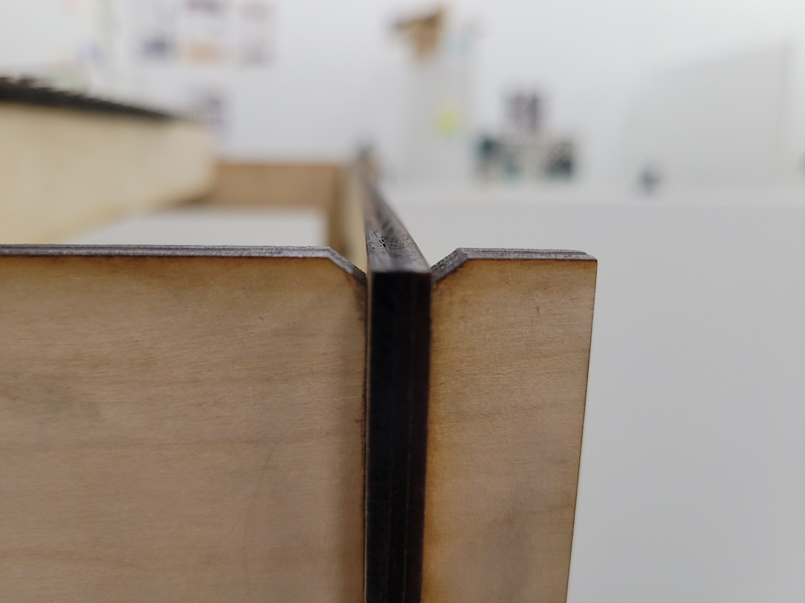
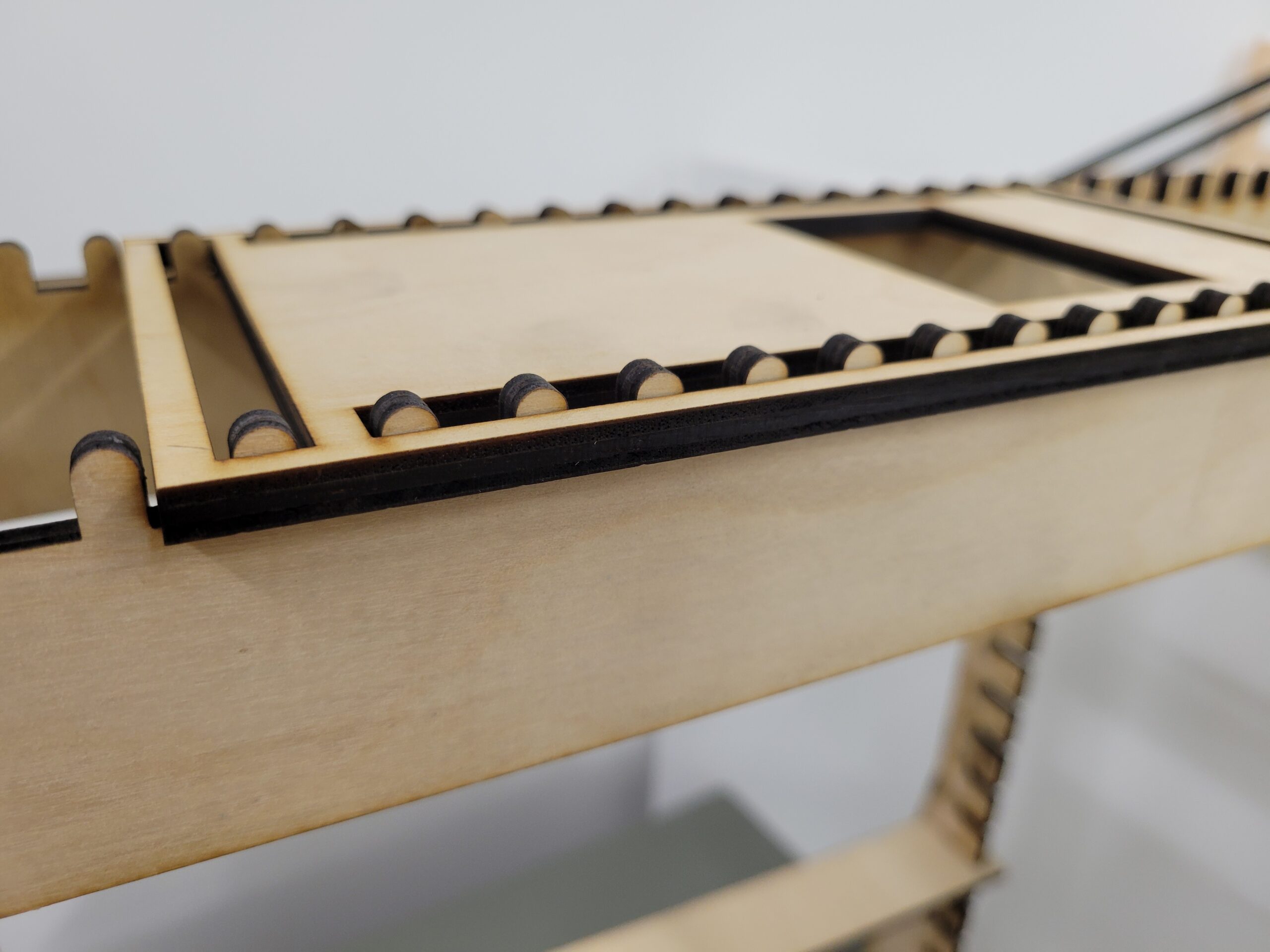
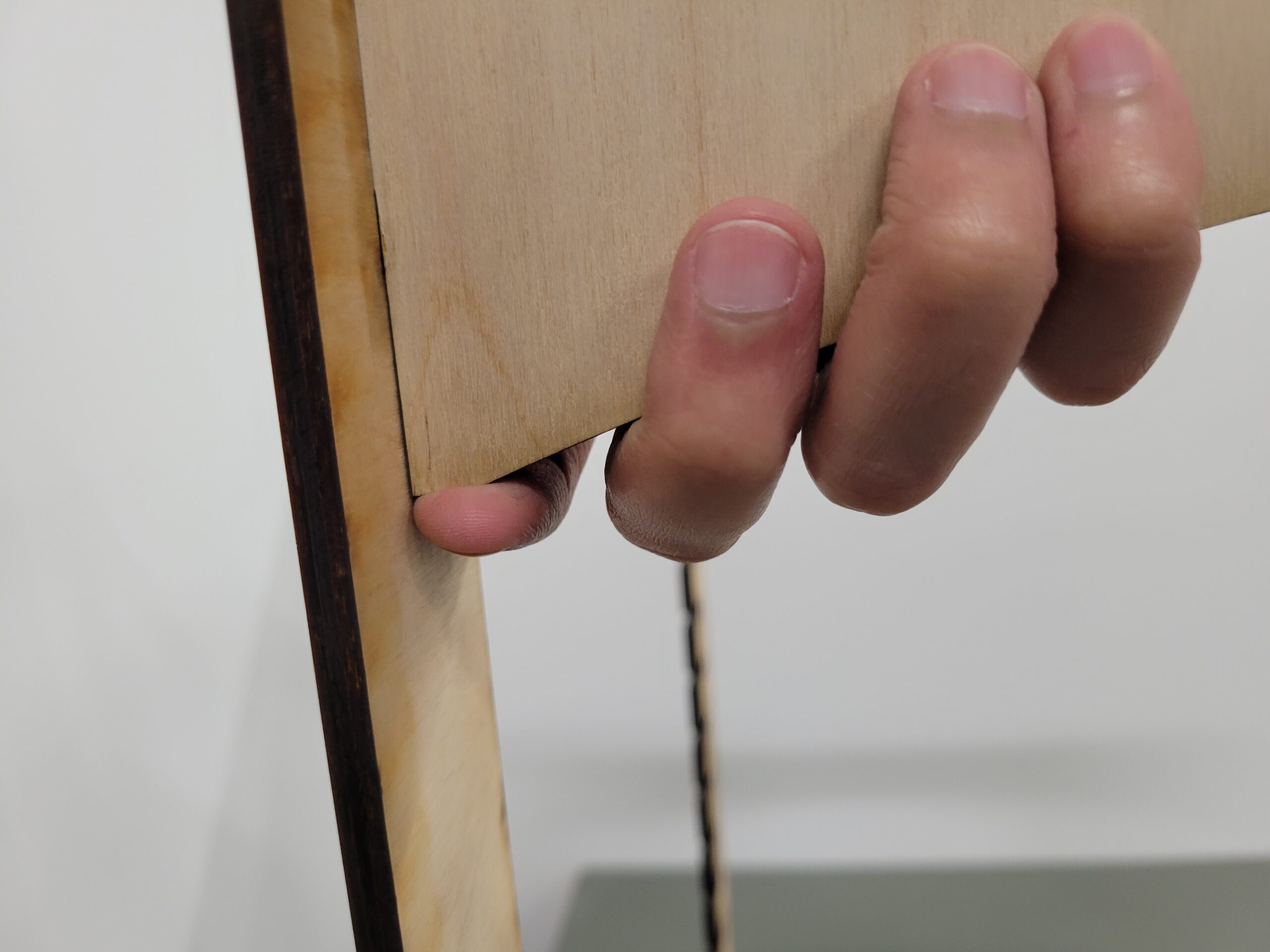
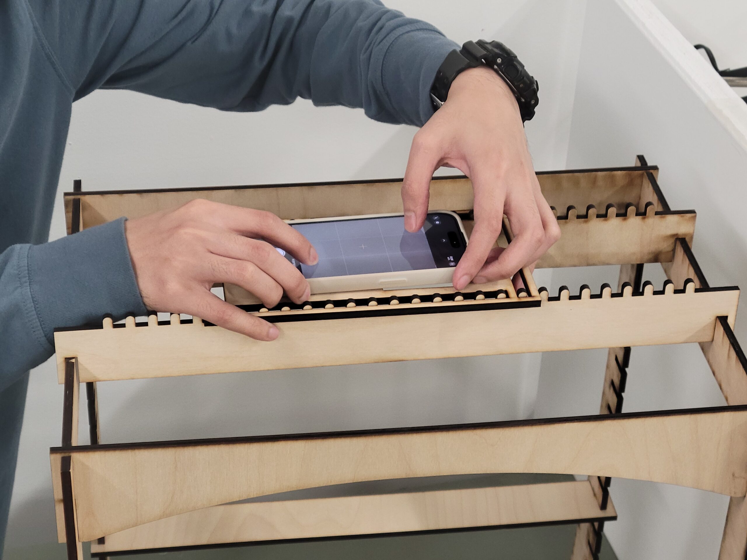
The phone holder was revised to have slits instead of a pattern of slots so putting it on and pulling it off the ridged beams would be easier and faster. The tolerance of the joineries, thanks to the tolerance test previously conducted, held strongly with the overall assembly being rigid enough to avoid wobbling while still being able to be disassembled without parts breaking off. To aid this disassembly even further, joints were chamfered to loosen the openings as well as the structural braces were designed with small flat surfaces where fingers may rest on that aids in pulling said braces off.

20231019_135130
20231019_140035
20231019_135102
20231019_135824
20231019_135312
20231019_135838
20231019_135639
20231019_135623

Final Outcomes

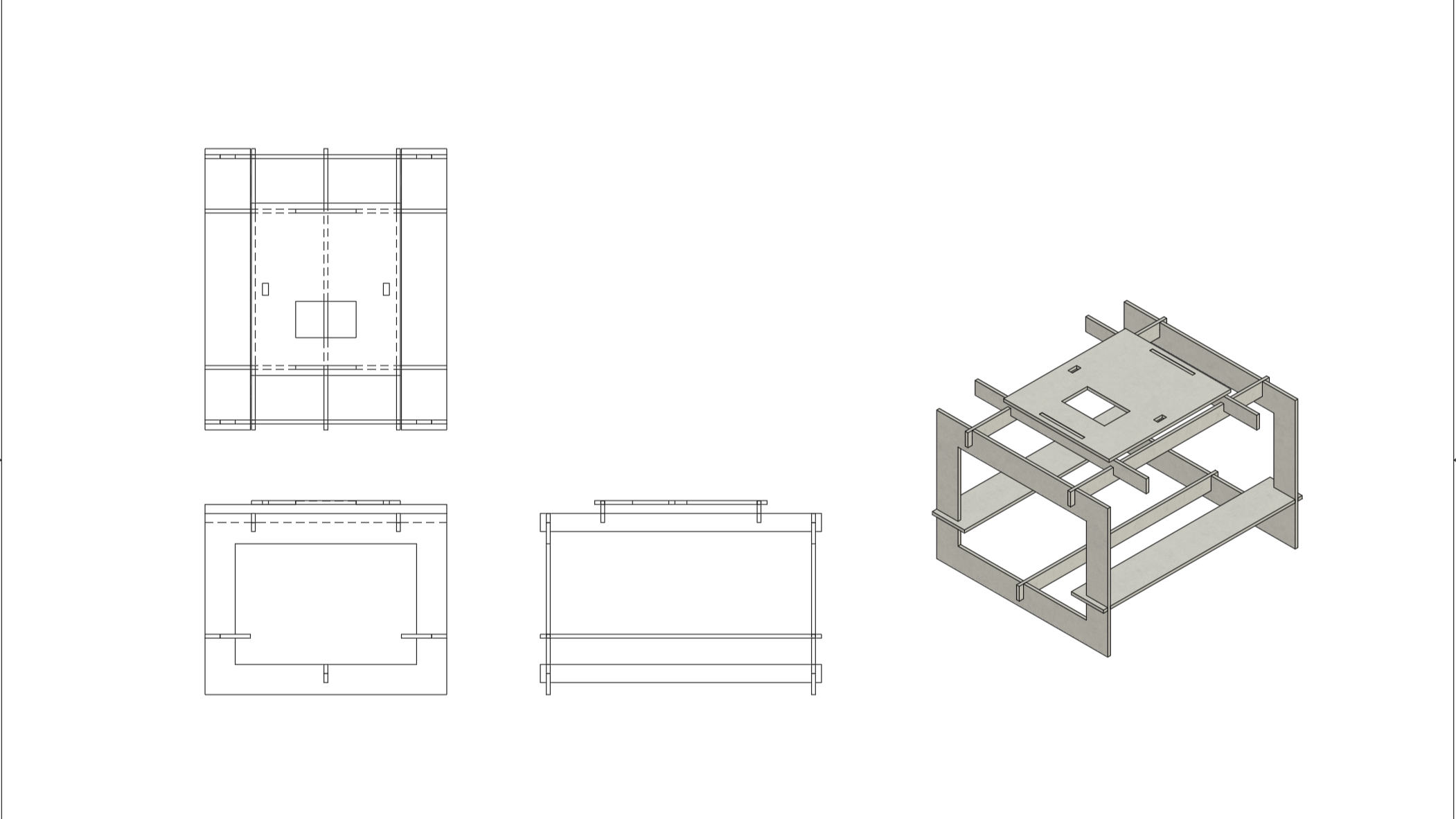
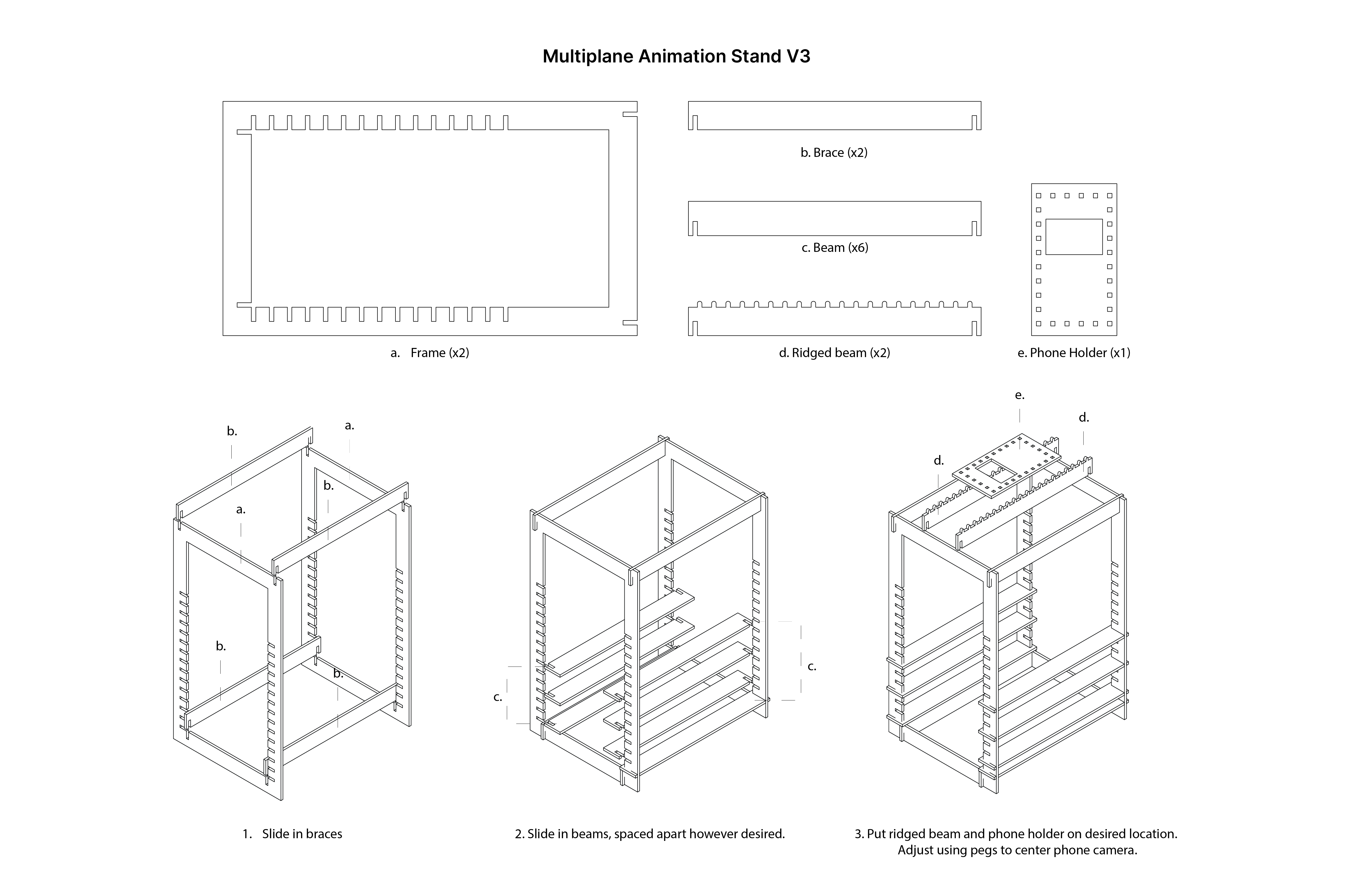
To conclude the project, I designed an assembly instructions sheet as well as a ready-to-cut laser cutter Adobe Illustrator vector file. These can be downloaded by student animators and enthusiasts and have fabricated in fabrication labs in schools and maker spaces in order for them to build their own multiplane animation stands.

Nimble Animation Stand Assembly
Screenshot+2024-06-22+181100

The Vector File is available to be laser cut and assembled, following simple instructions.

Reflections

Working on this project made me appreciate a more hands-on iterative process to designing. The constant making of physical prototypes and testing them part by part that stacked on top of one another allowed for the final iteration of the design to sit where it is now.

PXL_20230918_170647859
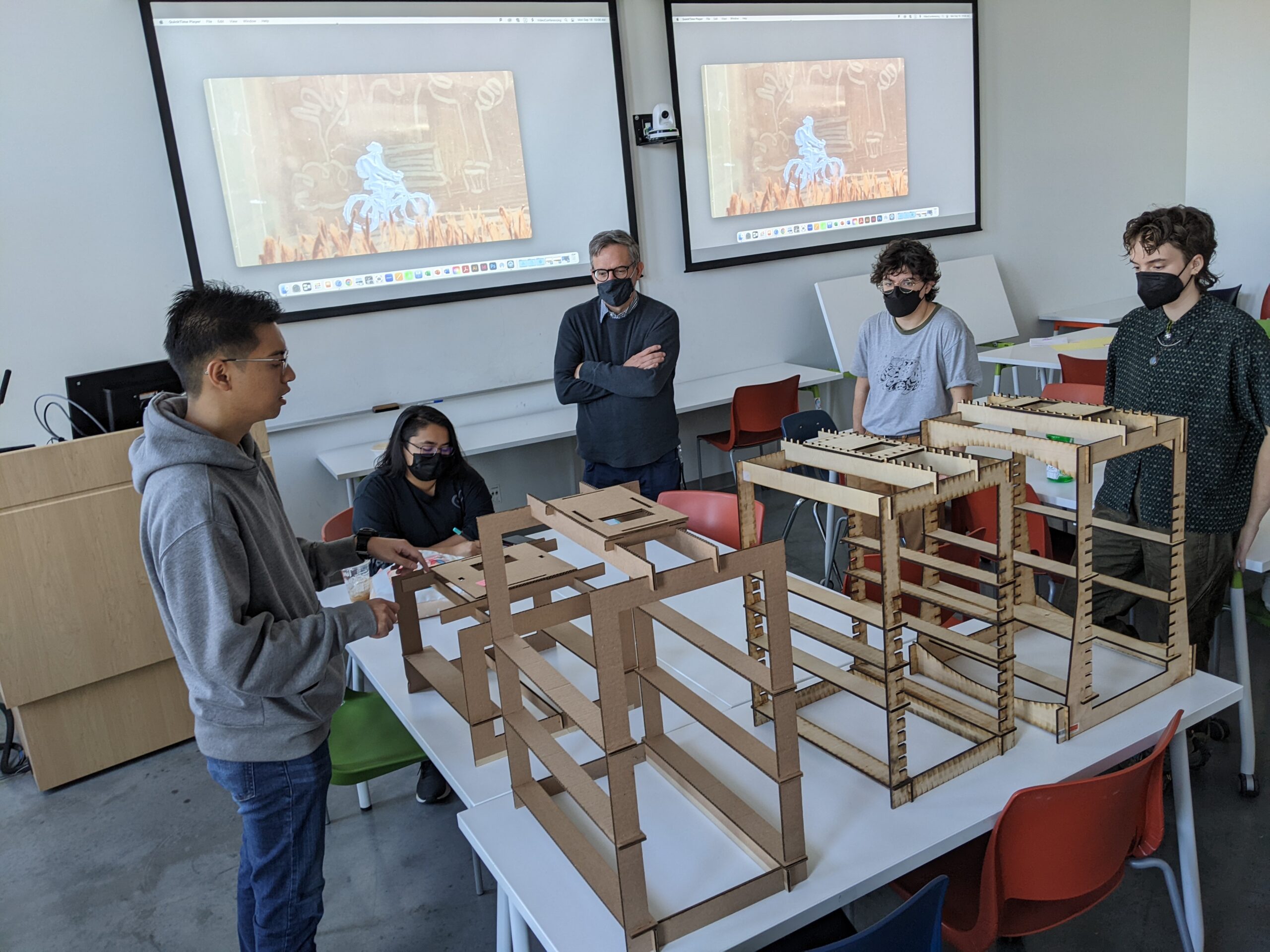
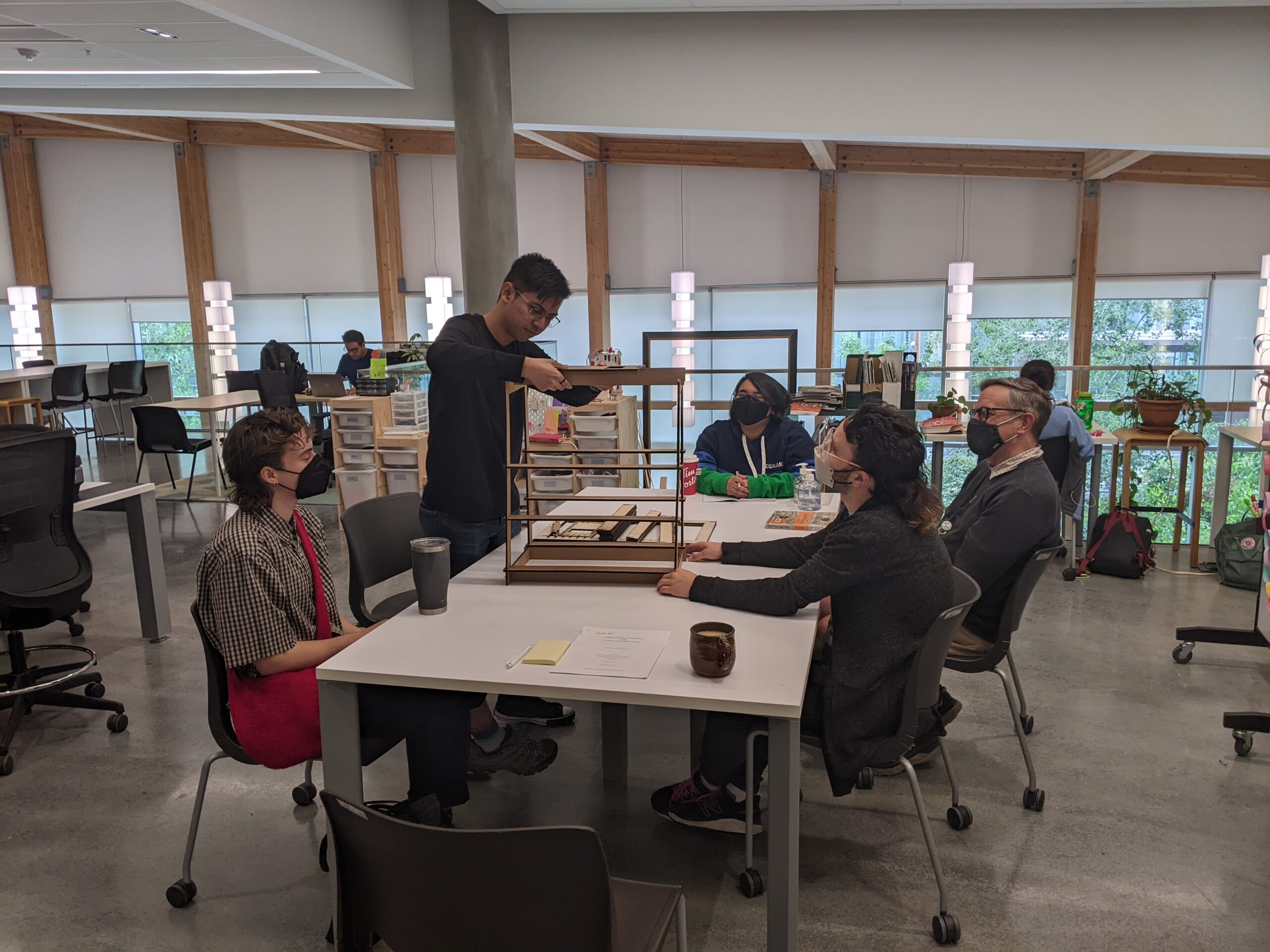
Final meeting showcasing the various iterations of the project.

By the end of the project, I was able to see all of the iterations I have made in physical form in the same room as the team had circled around a table that had all cardboard and wooden prototypes, seeing the differences and improvements in each one. Not only was this helpful for me, but it was also very helpful in communicating design decisions made throughout the project to other people, again going back to my goal in my design and research practice being: not telling people about my work, but rather having them experience it.